Friday, June 28, 2013

Something's Rotten with Dutch Art: Part 2 Rijksakademie has Fallen


What do you get if you mix a mafia boss with a modern art curator?  

Answer: someone who makes you an offer you can't understand.


In the previous entry of this series, I had a go at the Art Zuid 2013 exhibition for their poorly curated outdoor sculpture choice of post-modern nonsensical "art".

However, as you can see by the title of this series, this is in my opinion a wider problem in Holland and in today's article I criticize what, in my opinion, should be the last bastion of hope for high quality esthetics and art in the Netherlands:  the Rijksakademie.

I found out about the Rijksakademie while doing research and trying to find an art academy in Amsterdam that had kept the old master's traditions alive. 

With such a name to uphold, I expected a group of people pushing the disciplines of academic drawing, painting and sculpting to the limit, and churning out works of art that would be known worldwide.  An institute sought by artists with high aspirations, where masters would take students under their wing, and which would be the envy of today's academies in Florence and Paris.

You can imagine my surprise when I arrived to their homepage and saw a slide show, in which they put forward what I presume is their 'best foot':


So it is safe to say that the Alamo has fallen. The Rijksakademie is now totally divorced from the esthetic and artistic values that put Dutch art on the map, and is instead engaged in some wild goose (or duck carcass) chase. Some weird sort of experimental  ...  ehm  ... experiment. 

In my next article I will try and speculate how and why this is the case, but for now let's see if we agree whether it IS the case.

To try and drive this point home, I've prepared a series of photos of random images downloaded from the Internet.  Of all these random things, one of them is a piece of art made by a resident artist of the Rijksakademie, and you must guess which one it is:


 A guy in a corner with some trees and fruit on the floor and a plastic dead dog.


 A man holding a baseball bat wearing a red shirt.


 A woman drinking from different glasses, with mandarins while someone pours water, in Holland's Got Talent style


Some kind of figure's image peeled away and destroyed.


A high-tech-looking rubber carpet.


 A rather crappy painting with people.


 A metal fence.


 A guy jumping in the dust on some industrial grounds.


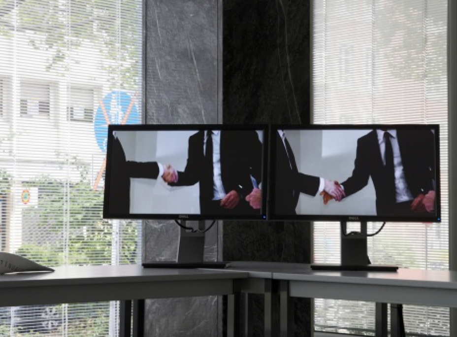
 Two monitors with business men shaking hands.


Photo of a parking lot with some cars and trees around.


A board burnt and melted with some colors.


A board with some masking tape, where something was probably painted before.


Notice you should already be worried by the fact that the piece of art doesn't exactly jump out at you from this series.  That in itself is a sign of something...
 
Now, as for the answer.  Did you guess which one was the Rijksakademie piece of art?

Well, surprise!!!   They are ALL Rijksakademie pieces of art.

Yes.  These beautiful creations is what these people are busy with, only a stone's throw away from the Rijksmuseum, which just reopened and is now hailed as one of the best museums in the world.

Not surprisingly, some of this stuff is being show in the Tate Modern in London. An artistic institution so rarefied, it can get away with showing you just about anything as art and get away with it, so long as the story sounds plausible.

A case in point is Gabriel Orozco's white shoe box exhibition piece, which is...well a white shoe box:


The curator says, with that typical deep high-brow tone of theirs, that Orozco is an artist that "often likes to disappoint people".

I think that is a disgraceful statement. When even the wish to disappoint is praised, we've just been stripped of our ability to call a turd a turd.

In my submission, the current philosophy of the Rijksakademie is a sham, creating turds and then dressing them up in all sorts of convoluted explanations to make them seem interesting.

Beautiful art is on its own.  And when I say that, I mean it does not count with the 3.3 Million Euros that the Secretary of Education, Culture and Science spends on the Rijksakademie every year to make this kind of stuff.

Now, less I start to sound like a fascist to all those free experimental souls out there, there should be room for everyone to play.  So my take on it is this:

IF, you want to throw a plastic white dog on top of some dry Christmas trees and give a name to it, or put the carcass of a duck inside a cement crusted bulldozer blade, then by all means go ahead and do it, but don't expect:

1. Praise or recognition,

2. Entire organizations at your service, and

3. Subsidies


Do it like everybody else does and try to see if you're stuff is really worth making, and whether it is of value to anyone other than yourself and your little club.  If this strange and unique category you've dreamed up is only interesting to 1 person, well, you have your answer and government shouldn't be sponsoring your randomness over anyone else's.

This last point is important, because it implies that tax payers are funding art that not everyone likes or approves of. Technically buying things they would otherwise despise at the benefit of a few artists and ignoring others.

It also means that the government is having an opinion on which type of art deserves funding and which type doesn't, which should not be part of public policy in my submission.


Under their 'donations' page the Rijksacademie tells us to "Support the art of the future, and the artists of today".


I really hope the art of the future looks better than this.

Wednesday, June 26, 2013

Something's Rotten with Dutch Art Part 1: The Art Zuid Embarrasment


Something's rotten with much of Dutch current day art and everyone knows it.

I may be no learned art critic, but all one needs to do is take the pulse of the industry to get a feel that the home of the old masters is producing little worth writing home about these days.

From the Art Zuid embarrassment, to the mediocre level of the Affordable Art Fair and Art RAI events, and ending in the downright disgraceful produce of the Rijksacademie, which would make Rembrandt, Van Dijk, Albert Cuyp and Vermeer turn in their graves.  But more of that in the posts to follow.

I want to start this post series with a quote by Harold Speed, author of The Practice and Science of Drawing, widely acknowledged as one of the best ever books on the subject, and now relegated to the free download section of www.archive.org. A bad omen in its own right.


Speed says referring to the artist's correct use of old artistic conventions:

"The result is likely to be something very different from the violent exploits in peculiarity that have been masquerading as originality lately. Originality is more concerned with sincerity than peculiarity. 

The struggling and fretting after originality that one sees in modern art is certainly an evidence of vitality, but one is inclined to doubt whether anything really original was ever done in so forced a way.  The older masters, it seems, were content sincerely to try and do the best they were capable of doing. And this continual striving to do better led them almost unconsciously to new and original results.

Originality is a quality over which an artist has as little influence as over the shape and distinctions of his features.

If an artist does not have a strong original personality, it is a matter of opinion whether he is not better employed in working along the lines of some well-tried manner that will at any rate keep him from doing anything really bad, that in struggling to cloak his own commonplaceness under violent essays in peculiarity and the avoidance of the obvious at all costs."


I think Speed has summarized it brilliantly.  What we see in the case of Art Zuid is an exercise in peculiarity and little else in my submission.  Esthetics, beauty and craftsmanship have been all mindlessly sacrificed, as offerings to the goddess of "I'm so different and explorative".

Had I been a donor or sponsor to this, I'd ask for my money back and god forbid this came out of tax-payers money.

The total rejection of the old artistic knowledge and conventions, which Speed talks about, leaves us dangling in the wind with random attempts at .... well ... something.  The result is a series of, pardon my French, brain-farts made flesh.


Take the following piece, an interesting idea of wooden feet along the grass. So far so good. But then carved with what seems to be a daft table spoon instead of craftily chiseled into beautiful pieces of the human form.  Why?  Because its 'cooler' to make something with the finish quality of a 5 year old.  And lets not forget, easier, because making beautiful things is bloody hard.  And who wants hard.


Or a mirror with the shape of an ironing board. Yea, we're really breaking new ground here.


There is something about these sculptures, and current day painting that demands that we suspend all our critical faculties in favor of nonsense.  The biting remarks we would make at a crappy song or a crappy book seem to go out the window when we're presented with a crappy sculpture or a painting, because we're made to think we just don't get it.

Then our typical response: "yea, I guess it's kind of cool."

I don't hate experimentation.  There is a place for everything, but that does not mean everything should be labeled as good, or even acceptable.  Rewarding foolishness and mediocrity, and letting it go on only ensures we get more of it.

And if we do let it go, we best be preparing an excuse when people look back at Holland and try to figure out how in the world we went from Vermeer's Milkmaid:


To a plastic guy in pink with a lemon for a head:


They say every society gets the art they deserve, so I think we should make it clear to the artists and organizers that we demand better. Much better.


PS. I'm reminded by a friend that not all art in Art Zuid is Dutch, but that the choices were unfortunate and certainly made by Dutch curators.


Share and Like if you agree :0)


Photo credits: Joost Molegraaf


Sunday, June 16, 2013

How to Paint Like Paul Cezanne

During my first (and last) painting class in Amsterdam, which lasted for about 10 sessions, I was asked to try and paint a still life in the style of Paul Cezanne, which according to my teacher was a simple master to emulate and an easy way to learn technique.

What inevitably followed was a terrible attempt of trying to learn drawing, brushwork, color mixing and composition, all in two 3-hour sessions, with an inevitable weaksauce result:


Frustrated with what had just happened I took a trip to the Hermitage museum, which is a few blocks from my place, and was showing an impressionist exhibition including 3 works by Cezanne.


Here are some of the notes I made from two paintings.  I decided to share them, because we don't usually hear this sort of information from curators and other people who know art.  They tell us what a 'disturbed character' the artist was, how they painted this the year 19xx, or where they lived and who they hung out with during that time, and the feeling conveyed by the piece.  So what I think is lacking in all that is how the bloody painting was made, and my notes may seem mundane, but they are a technical look at a Cezanne.


Landscape Notes, The Banks of the Marne


Limited Palette:

First thing you notice is how limited his palette is. Basically down to white, green, blue and brown.  This gives imediate unity and atmosphere to the piece.

Brushwork:

Then there's one of his big trademarks, the short uni-directional brush strokes. These are grouped in directional patches which are determined by areas of the same color and value.  Contrary to the impression of totally loose and careless spontaneity that his work protracts, I have the feeling it was rather meticulously executed.

The brushwork seems soft and using rather meager amounts of thinned oil paint. Texture doesn't seem to be a concern and you can clearly discern the canvas grain through the paint.

There is no visible light source, he goes for atmosphere instead

Finish:

Several patches of the canvas are left totally untouched and you can see the white or faded yellow showing through.  Also, he doesn't seem concerned with softening his brush strokes too much.  They seem carefully made, and then left as they are.

He also seems to leave some of the drawing outlines around objects such as mountains.


Still Life Notes, Fruits


There's significant differences here versus the landscape. I'm not good at judging composition yet, but he seems to divide spaces quite radically the wall, the fruit, the cloth, the vases and the table.  Each of them being of a certain value family.

Although the brushwork and outlines around the objects still make this a very recognizable Cezanne, the amount of paint he uses is much more generous compared to the landscape.  The background only uses directional strokes around the objects on the foreground.

Also, the direction of the brushstrokes is sometimes aiding, and sometimes in oposition to giving body and roundness to objects such as the bread and the apples.

He uses hard edges for his main objects.

Other details include the fact that his table and vases are always crooked and misaligned.  Same goes for the shape of objects like the bowl.

He uses several layers of color for the apples, which have some 4 different tones of orange and red.

For painting classes in Amsterdam and other art lessons:  www.juanpablobran.com/lessons.html


Saturday, June 15, 2013

Master Copy of Jeremy Lipking's Danielle in Kimono

Danielle in Kimono, Jeremy Lipking


I've been following the work of Jeremy Lipking for a while and have become a big fan, so it was due time to create a master copy of his paintings. Danielle in Kimono seemed just right because it gives a nice challenge to try and learn his handling of flesh tones, edges and drapery.

Here are the steps, some notes on the challenges and the final result. In conclusion, the guy is an accomplished master, and there's lots more to learn before reaching his level, but still, an honest amateur attempt, and lots of stuff learned in the process.


The main drawing felt relatively easy, although as you see later, I made critical mistakes regarding the width of the head, the position of the chin, and the jawline :0( the lesson here is to spend more time measuring and get it right in the beginning stages.  The underpainting color was easy to choose, because Lipking's characteristic style is to leave large patches of it showing through in the final work.  


Here we start to have a go at some of the flesh tones, but to achieve the degree of realism that he has, it's necessary to navigate an extremely narrow band of values and color temperature, so this will be a mission-long struggle.


Here you see both the flesh tones and the background color varying wildly.  The reason is I'm using a photo on my computer as my original, and the ambient light around me keeps changing.  Sometimes the background looks to orange compared to my original, sometimes it looks to purple. So I have to decide for a color harmony and just stick to it, which I finally manage to do, as you see later.


The picture at the beginning of this series has fairly solid flesh tones on the face, and the one at the end is very patchy.  The reason is I was happy with the result at first, at least color-wise, but I realized that the paint was very thin and not satisfying in terms of texture when looking at it up close, so I painted over with thicker wet-on-wet brush strokes to try and make the painting more exciting.

Later on I will smooth things out.  I start to work also on the drapery, which is a challenge because it has slightly different dark colors and patterns that need to be just right, as well as spontaneous areas left untouched.


At this point I've nailed the ear (always a nice small victory!) and I'm working out the patterns on the Kimono.  Flesh tones are solid and the drawing has been corrected for a nicely shaped head.

And here is the final result!


Let's compare it to the original...


Some of my darks will probably become alive once I varnish and shoot the photo in better light conditions.  

Now I have a Lipking in my kitchen :0)


If you want painting lessons in Amsterdam, or drawing lessons in the academic tradition, get in touch!

www.juanpablobran.com/lessons.html


Happy painting!