In this post I will try to offer some insights into the different media with which you can draw. Each has pros and cons and they can be used depending on the kind of finish that you're after in your drawings.
During my Amsterdam drawing lessons I try to encourage students to get to know their materials as well as possible. We normally begin working with pencil. Here's my take on regular graphite pencil as a tool for drawing.
PENCIL:
There are several advantages to pencil when learning to draw. The first is simply how familiar we are with a pencil as an instrument. It is unassuming and well known to us, and we feel comfortable using it as an every day thing. Therefore, it poses no challenges of its own and allows the student of art to relax and focus on learning about lines, and values and other things without being intimidated by the material.
Pencils are also easy to get, easy to carry and very easy to sharpen (for the most part). The drawing precision that we can get from a finely sharpened pencil tip is unrivaled, and we can create incredibly intricate drawings. The calligraphy from a pencil drawing can go from very fine rendering, with extremely nuanced gradations between values, to beautiful cross hatching made possible by its fine tip.
Pencils also come in a large range of softness allowing for great nuance in our use of tones aided by the tool even if the artist's hand is still not fully educated. They are cheap, easy to find and create great finished pieces or drawing studies. They come very handy to use with small sketchbooks that we like to carry around with us all the time.
So far so good. You would think at this point that the pencil is the perfect drawing tool and that there's no need to depart from it. However the humble pencil has some unavoidable drawbacks.
For starters, the tonal range is very nuanced, but creates what can generally be considered high-key drawings: drawings that are fairly light. Even the darkest usable pencil, which as far as I'm aware is a 9B cannot make very dark blacks. Sure, they can be dark enough in relation to the rest of the picture and will make for beautiful drawings, but they're nowhere near what we could call true black.
This means that the pieces created with pencil will have a quite and elegant nature to them, but they will not be particularly impacting from a distance and in my opinion this also hinders the size of pieces that can or should be created with pencil.
What is more, using pencils in the high B's, which are the softer and blacker kind is far from ideal in my view. Getting a really dark result tends to severely irritate the paper, and the graphite creates a very reflective dark, which is the worse dark you can aim for. Also, I've tried many different ways to sharpen 8B pencils and the tip just keeps braking inside the sharpener or by the pressure of the blade, which means your high B pencils typically end up with a daft tip, defeating the entire idea of using pencils in the first place.
Because of the nature of the medium pencils will also be quite poor, in my opinion, at creating highly organic-feeling drawings. The result tends to usually be quite clinical and often "cold". They are also not an ideal tool for learning to draw in a tonal manner, and favor the use of line.
VINE CHARCOAL
This is a great medium too and its almost a polar oposite of pencils. Vine charcoal are sticks of charcoal made from the vine tree. There is also willow charcoal and as far as I can tell the main difference is how soft and powdery the sticks are.
Sometimes the sticks will be fairly straight as if manufactured, and others there will be quite some bending on them.
During my Amsterdam drawing classes, students will experiment with vine charcoal about 6 or 7 lessons in, once they've learned the basics of line, tone and edge.
This medium is extremely forgiving and fun to work with. You can toss it around the paper adding some tone here and deleting there. It's a very tonal way of working and some say that it resembles painting more than it does drawing, and I would tend to agree. We can obtain extremely "organic" and painterly looking drawings with vine charcoal and the material allows you to obtain something very close to black if you want to.
What is more, the powder that comes from sharpening the sticks can be saved and later used to tone paper to work in an even more tonal manner, what is called substractive or negative drawing where you add tone as much as you take it away. There is no other way to obtain such results.
The ability to throw the powdery material around in such forgiving manner is unique to vine charcoal and when looking for expressive abstract and experimental results on a drawing I believe this is the best way to go.
Large formats welcome this medium quite well and the expressive fresh thick lines that can be achieved with it are quite unique.
There are, as with pencil, some downsides to the material. The biggest one as far as I'm concerned is the fact that vine charcoal needs to be fixated onto the paper once the drawing is finished, or it would only take the swipe of a finger to obliterate the drawing. The powder sits fresh on the paper and you must spray a glue fixative to make it permanent. The fixative doesn't smell great and I suspect is also not very environmentally friendly.
What the fixative does do is allow you to add more layers later on and get darker blacks, though in my experience this distorts the value relationships you had previously achieved.
Additionally you looks a lot of precision compared to pencil. Though the vine charcoal sticks can be sharpened with a normal pencil sharpener, they wear so quickly its not too practical, although I've been able to get quite a bit of precision this way, its never close to what you can do with pencil. The medium is not meant for it. Willow charcoal is impossible to sharpen and every attempt will result in a broken tip stuck inside the sharpener which is extremely irritating when you have a model posing and time ticking by.
This means that in general, formats A4 and smaller are not ideal for charcoal, and because of the need for fixing, neither is a sketchbook.
Vine charcoal is also more difficult to find as your typical stationary store will not carry it and you need a real art supplies store to procure it.
CHARCOAL PENCIL
The charcoal pencil is somewhat of a hybrid between the regular pencil and the vine/willow charcoal.
It comes in a pencil form but the medium inside it is made of compressed black charcoal. Its a fantastic tool because it comes in several grades of hardness allowing for a spectacular tonal range, which while not as nuanced as pencil can get both great precision and incredibly dark blacks, which I think go darker than vine charcoal.
The pencil can be easily sharpened with both a sharpener or a single edge blade and the tip can be brought to a very fine end. It is fairly easy to manipulate given that it resembles the pencil so much.
On the downside, it is less easy to erase compared to vine charcoal and its marks tend to be a bit more sticky and permanent on the paper.
There is a variant to this type of pencil which can offer very nice results which is the use of red or sepia Conte pencil, which has color in addition to the properties mentioned above.
Hope this gives you some understanding of the materials.
Cheers from Amsterdam!
Tuesday, July 15, 2014
Wednesday, July 2, 2014
Amsterdam drawing lessons - back to the drawing board
In my Amsterdam drawing lessons I try to emphasize the importance of drawing as the foundation for visual art, whether you aim to be a draftsman/woman, a painter, an illustrator or even a fashion designer, such as is the case with some of my students.
Since I strongly believe in practicing what you preach, I spend most of my time reinforcing my own drawing technique and only occasionally going into painting. I consider drawing to be the training and painting to be the fun, or the event you've been waiting for.
There are a few advantages to this approach. One of them is to build a very solid base on top of which to base your work. If you have to constantly second guess your drawing skills, there won't be any bandwidth left in your head to make a true artistic statement if your aim is to create realist figurative art.
Secondly, your drawing practice is cheaper and more practical. All you need to keep the skill growing and becoming second nature is to sketch and the tools are a piece of paper or notebook, pencil and eraser. Some people prefer pen, which is also fine. Compare that to the endeavor of painting which requires solvents, mixing, brushes, cleaning and potentially making a mess out of your clothes and the choice becomes clear. Add to that the cost of good acrylic of oil paint (and you should always use the good ones) and your have a few good reasons to keep going back to the basics.
During my drawing classes in Amsterdam I discuss the use of materials, and I may go into some of that in a later post, but in this one I will go on a bit more about drawing vs painting.
Here are some of the portraits I created during the Portrait Month, which takes place in April at the atelier where I often paint and draw from the live model in Amsterdam.
Considering that these are portraits created in 3 hour sessions, with changing daylight, I was pleased with the colors and values that resulted from them. More satisfying though was the fact that the drawing was very solid in each case and that I was able to pull off full color portraits in a single session, being extremely accurate regarding construction of the head and the resemblance of the models involved.
The material used in this case was Canson paper (the rough side) and Caran d'Ache pastel blocks and pencils, which are again very high in quality and give you pigments that are a pleasure to work with, as well as the ability to create layers easily given the fact that they are hard pastels, not soft.
Once the portrait month finished I retreated back to learning more about drawing and even went back to the very basics of portraiture, including the head lay-ins of the (Andrew) Loomis method, and more intense studying of the Reily method, gaining even further knowledge of constructive drawing, placing of the features, fast sketches and drawing calligraphy.
This may sound silly for someone who can already draw, but I went quite deep into methods of sharpening the charcoal pencil, different grip styles and the use of papers that I did not know about.
The key message is certainly to not underestimate the studying of the basics, nor to neglect them because you feel as if you "know enough". Art and drawing in particular really are about the details, the understanding you gain and how you apply it by knowledge of the subject, the tools and the masters who solved problems before you.
I hope to have enough discipline to reserve some time every year to revisit these basics as I immediately see the effect they have on my work.
All the best!
Since I strongly believe in practicing what you preach, I spend most of my time reinforcing my own drawing technique and only occasionally going into painting. I consider drawing to be the training and painting to be the fun, or the event you've been waiting for.
There are a few advantages to this approach. One of them is to build a very solid base on top of which to base your work. If you have to constantly second guess your drawing skills, there won't be any bandwidth left in your head to make a true artistic statement if your aim is to create realist figurative art.
Secondly, your drawing practice is cheaper and more practical. All you need to keep the skill growing and becoming second nature is to sketch and the tools are a piece of paper or notebook, pencil and eraser. Some people prefer pen, which is also fine. Compare that to the endeavor of painting which requires solvents, mixing, brushes, cleaning and potentially making a mess out of your clothes and the choice becomes clear. Add to that the cost of good acrylic of oil paint (and you should always use the good ones) and your have a few good reasons to keep going back to the basics.
During my drawing classes in Amsterdam I discuss the use of materials, and I may go into some of that in a later post, but in this one I will go on a bit more about drawing vs painting.
Here are some of the portraits I created during the Portrait Month, which takes place in April at the atelier where I often paint and draw from the live model in Amsterdam.
Considering that these are portraits created in 3 hour sessions, with changing daylight, I was pleased with the colors and values that resulted from them. More satisfying though was the fact that the drawing was very solid in each case and that I was able to pull off full color portraits in a single session, being extremely accurate regarding construction of the head and the resemblance of the models involved.
The material used in this case was Canson paper (the rough side) and Caran d'Ache pastel blocks and pencils, which are again very high in quality and give you pigments that are a pleasure to work with, as well as the ability to create layers easily given the fact that they are hard pastels, not soft.
Once the portrait month finished I retreated back to learning more about drawing and even went back to the very basics of portraiture, including the head lay-ins of the (Andrew) Loomis method, and more intense studying of the Reily method, gaining even further knowledge of constructive drawing, placing of the features, fast sketches and drawing calligraphy.
This may sound silly for someone who can already draw, but I went quite deep into methods of sharpening the charcoal pencil, different grip styles and the use of papers that I did not know about.
The key message is certainly to not underestimate the studying of the basics, nor to neglect them because you feel as if you "know enough". Art and drawing in particular really are about the details, the understanding you gain and how you apply it by knowledge of the subject, the tools and the masters who solved problems before you.
I hope to have enough discipline to reserve some time every year to revisit these basics as I immediately see the effect they have on my work.
All the best!
Friday, May 23, 2014
Drawing lessons Amsterdam - The use of Edges
It's been quite some time since my last post, and I'm no longer teaching drawing classes in Amsterdam during the week other than weeknights. But I thought I'd continue with the blog just to keep sharing things that I'm discovering as I go along.
The past year I devoted almost exclusively to drawing and strenthening my skills as a draftsman before trying to paint and do fancy stuff. Last couple of months I felt like going back to painting, from life that is, and although the results are not particularly good, I do see a noticeable difference an it is all based on better draughtsmanship skills and feel for composition.
You usually learn more from your failures than from your successes, and I know most artists only like to publish the latter, so here is a painting that is overall in my opinion not a success, but from which there are nonetheless things to learn.
I decided to use it to illustrate the much neglected and yet crucial use of edges in your drawing and painting technique. In my Amsterdam drawing lessons I teach the idea of edges very early on, usually on session 2 when we're drawing a sphere and learning about light and how to turn form. However it us usually soon forgotten and must be constantly considered in our visual art endeavors.
The image below was a painting from a live nude model laying in front of a mirror. It was painted with Cobra water-soluble oils on an oil paper surface with fine grain.
I want to draw your attention to the use of edges to communicate texture, distance and focus in the image. The biggest contrast in edges can be seen between the edges of the image reflected on the mirror, and the wooden yellowocre frame of the mirror itself.
Look at the edges inside the mirror. They are all vague and smoothened out. They seem blury and distant. To compliment this effect, I made use of horizontal blending strokes, and I also made sure that the chroma (or saturation) of my colors was lower. You can also see that the mirror contains neither the darkest dark, nor the lightest light in the image. The values in it are compressed.
Contrast all that fuzzy feel and blury edges, with the hardest, straightest edge of the sketch, which is the mirror frame, and especially the inner side of the vertical frame on the far right. I made that edge with a pallet knife to make it razor sharp and communicate that we're dealing with a solid artifical object. The edge brings the frame forward and pushes the fuzzy image inside the mirror back.
In reality, the image inside the mirror was as sharp as the rest of the scene, its colors, values and edges were no different. Therefore I'm making use of all these tools to make a compositional point and guide the eye of the viewer to the real focal point.
The use of edges doesn't end there. You can see how edges vary around the whole image getting harder as you get closer to the nude, and softer as you get away from it. Edges are highly related to values, which is why you can see the little white frame on the top left with soft edges and barely any value difference between it, the image it holds and the wall behind it.
The nude figure itself contains a variety of edges around it, some soft, some hard and some completely lost in the background.
The white pillow under her is clearly separated from the purple cloth by a hard edge, which is the biggest light and dark contrast in the image communicating that it is nearby and drawig the eye to the middle.
This was the result of 2 sessions with the model, so nothing to be particularly proud off. Skin tones are OK, but in the end it was not the most successful painting. However it had some good use of edges which I thought made it worth blogging abit about.
Hope this helps!
Friday, February 7, 2014
Drawing Classes Amsterdam, Finishing a Study
In my Amsterdam drawing lessons, we explore the idea of when to consider a study as finished. In this short entry I'll try to provide you with some things to look for, as well as show you the finished charcoal piece that I was commenting on in the previous post.
It's generally accepted that the study of a final painting need not be made in the same material, and usually has less detail than the finished piece. The purpose of making a study is to creep up on the project and solve several of the potential problems before committing to the final piece.
If you think of it in terms of what an architect does, creating a master painting is like creating a building. You wouldn't dream of buying all the materials and putting people to work, before having a very clear idea of the blueprints, discussing different ideas with the client and exploring them, often using 3D software or miniature models.
This is the idea behind making study sketches. Even painters with a highly spontaneous reputation as Van Gogh, created endless studies for projects that were important to them. Having been lucky enough to visit the Van Gogh Museum in Amsterdam, I have seen the charcoal studies and a fully painted study of the Potato Eaters, one of his most famous figurative paintings.
My last post went into a bit of detail about this process and the resulting finished charcoal study of this piece is here:
I was quite pleased with the final composition, tones and general level of finish, the drawing quality being a given.
You can notice a large amount of detail work on her face which contrasts with the almost single tone nature of the sweater and the scarf. Even the hands were not rendered, since I wanted to use them as a light element within the dark area. The hair itself is a bit more illustrative than realistic.
So to know whether your study is finished check:
- First and foremost, is the drawing correct?
- Does the composition work or are there things you wish you would have done differently?
- Is there an attractive value abstract quality to the piece?
- Have you worked out compositional decisions about the light and edges?
- In the case of a realist piece, does it look real?
At the end of the study you should have the feeling that you have a real grip on the piece. You could say the study may stand as a fairly finished piece in its own right.
Time to begin thinking of the painting, which I have indeed begun. In my amsterdam art classes I try to delay using paint as much as possible because there is so much to learn about drawing, and because unless you have, paintings tend not to work.
I did not document the painting stages because I used a fairly direct method, and therefore made too much progress too quickly before the thought of documenting it hit me.
The current stage of the painting:
The areas of back-lit wall consist of nearly bare white canvas with a very light yellow gouache, as opposed to thick highlight paint. There is plenty of detail left to drive into the ear and hands, as well as the scarf.
A major change has been the decision to make the stripes on the scarf and to break down the sweater into basic areas of light and dark. The idea for the scarf came up when I noticed that my photo reference, as good as it was for tone and charcoal work, was terrible color-wise and gives me these very warm beetroot colors on the face, which I'm somehow trying to fix. It was clear that the face in general would not be the main focus point in terms of color and making the scarf stripped with slightly higher chroma seemed like a good idea.
However it still puts me in the terrible position to have to invent colors for the face, and my attempts to create a cooler mixture have quickly made the face look chalky, which likely means I would have to cool everything else together with it. I may have to accept that this simply was not a flattering light condition for the model.
Long story short, I'm not yet sure how this experiment will turn out in terms of color, thought he charcoal result is quite encouraging.
It's generally accepted that the study of a final painting need not be made in the same material, and usually has less detail than the finished piece. The purpose of making a study is to creep up on the project and solve several of the potential problems before committing to the final piece.
If you think of it in terms of what an architect does, creating a master painting is like creating a building. You wouldn't dream of buying all the materials and putting people to work, before having a very clear idea of the blueprints, discussing different ideas with the client and exploring them, often using 3D software or miniature models.
This is the idea behind making study sketches. Even painters with a highly spontaneous reputation as Van Gogh, created endless studies for projects that were important to them. Having been lucky enough to visit the Van Gogh Museum in Amsterdam, I have seen the charcoal studies and a fully painted study of the Potato Eaters, one of his most famous figurative paintings.
My last post went into a bit of detail about this process and the resulting finished charcoal study of this piece is here:
I was quite pleased with the final composition, tones and general level of finish, the drawing quality being a given.
You can notice a large amount of detail work on her face which contrasts with the almost single tone nature of the sweater and the scarf. Even the hands were not rendered, since I wanted to use them as a light element within the dark area. The hair itself is a bit more illustrative than realistic.
So to know whether your study is finished check:
- First and foremost, is the drawing correct?
- Does the composition work or are there things you wish you would have done differently?
- Is there an attractive value abstract quality to the piece?
- Have you worked out compositional decisions about the light and edges?
- In the case of a realist piece, does it look real?
At the end of the study you should have the feeling that you have a real grip on the piece. You could say the study may stand as a fairly finished piece in its own right.
Time to begin thinking of the painting, which I have indeed begun. In my amsterdam art classes I try to delay using paint as much as possible because there is so much to learn about drawing, and because unless you have, paintings tend not to work.
I did not document the painting stages because I used a fairly direct method, and therefore made too much progress too quickly before the thought of documenting it hit me.
The current stage of the painting:
The areas of back-lit wall consist of nearly bare white canvas with a very light yellow gouache, as opposed to thick highlight paint. There is plenty of detail left to drive into the ear and hands, as well as the scarf.
A major change has been the decision to make the stripes on the scarf and to break down the sweater into basic areas of light and dark. The idea for the scarf came up when I noticed that my photo reference, as good as it was for tone and charcoal work, was terrible color-wise and gives me these very warm beetroot colors on the face, which I'm somehow trying to fix. It was clear that the face in general would not be the main focus point in terms of color and making the scarf stripped with slightly higher chroma seemed like a good idea.
However it still puts me in the terrible position to have to invent colors for the face, and my attempts to create a cooler mixture have quickly made the face look chalky, which likely means I would have to cool everything else together with it. I may have to accept that this simply was not a flattering light condition for the model.
Long story short, I'm not yet sure how this experiment will turn out in terms of color, thought he charcoal result is quite encouraging.
Monday, January 20, 2014
Portrait Comissions, Study Process and Painting Composition
In today's entry I will provide a little bit of insight into the process I follow when creating a piece of art, whether it is one of my Amsterdam portrait commissions, or just an original work. Many of these techniques are discussed during my drawing lessons and painting classes, though most of what I will touch on in this post is discussed once the student has a grip on the basics and wants to start creating his or her own pieces.
The process begins with a photograph. In the case of this painting, I found a lady sitting on a cafe corner with back light and a very interesting pose, so I made a photo of her and promised not to share it with the world. This is the photo as originally taken, and I've blurred the face. You'll probably see it in the drawing, but I do have some integrity!
Because the taking of the photo was a bit of a difficult negotiation, I did my best to frame and shoot, while capturing the features as best as I could, given that the rest of the drawing would be fairly simple to figure out even in poor light.
The first step in creating the portrait is to decide how it will be framed. For this I decide to use the 'rule of thirds' principle of composition where you divide the rectangular space of the painting in three equal sections both horizontally and vertically and place important features on the dividing lines. You can see this more clearly when I show you the cropped result with overlapping markers:
Notice how the horizontal 3rds have been neatly divided among the very dark bottom, a middle value mid section, and the back-lit top.
There are other compositional advantages that I decided to exploit as well, and which were not totally planned. There is a strong horizontal line, as well as a scarf, which both lead the eye towards the face. Both the face and the hands are intersected by the main diagonal. One thing I did 'plan' or noticed and which made the picture good, is that I should be able to achieve a 'mood' in this picture due to the donwcast expression, which is complimented by the back light and the fact that most dark values are grouped at the bottom.
Another happy coincidence is that my hardest edge can be easily foudn in the forehead against the back light.
Now it's time to do a quick gestural sketch to capture the pose and get a feel for it.
The purpose of a gestural sketch is to begin assessing the pose you're dealing with. In this cake I wanted to make sure I captured that slouchy lost-in-thought gesture, and see if the composition I had framed in the photo worked well when translated to paper.
Gestural sketches can help us created an exaggerated version of the pose and here's where we take artistic license. These sketches prevent our drawing from taking on a feel that is too stiff and sculptural. They are a lot of fun and they can take anywhere from 30 seconds to 10 minutes depending on how much detail we want to capture.
You will notice that the drawing is very rough and I was not too concerned with the facial features other than marking them in and making sure that the angle of the forehead to the chin was correct to capture the gesture of the head as a whole.
The next step is to make a more detailed study of the face. I'm doing this to prevent my end product to look to overworked, so that my sketching can be cleaner and more direct. It also prevents my paper from becoming worn out or irritated through too much erasing. I never trace faces, it's important to learn how to draw them just like everything else. This is something I'm very clear about during my Amsterdam drawing classes, and I emphasize it in the portrait commissions I create.
The expression of the face in this sketch will be crucial to make the artwork communicate the feeling I want it to.
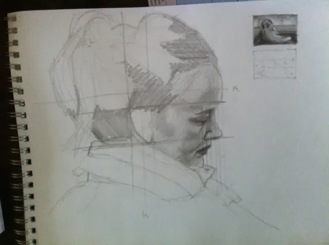
Here you see the portrait study drawing in pencil. It's not a perfect rendition but the line drawing is exactly what it should be. I say the rendition is not perfect, because first I have not spent enough time sorting out the value relationships and making this a proper drawing, and secondly, the values in this face do not correspond to the values I will use in the end result. You see for example lots of 'total white' on the face, while the final face will have 'lights' that are far darker than this. There will be no highlights on it and even the little rim light reflection on the forehead and nose will not be the lightest notes on the drawing/painting.
After I finish this portrait sketch, I trace some line markers that will help me draw the face in the next step of the process.
You will notice that the sketch drawing has a couple of little squares at the top right. A couple of words about what those are:
These are called thumbnails and they are a fantastic way to test the composition of your painting while including the tones you intend to use. The tonal structure of a painting is like it's skeleton. A painting can be both abstract or very realistic, but it needs to have an interesting tonal structure and composition if it is to succeed. Contrary to what most people think, color is not what makes a painting great. Color is the icing on the cake. The cake itself is made of a good tonal structure.
Sometimes you must create quite a few different thumbnails to play around with the tones and find a winning combination. In this case I felt the picture was already telling me what to do and only a few decisions were left. I created the first thumbnail and it felt right. The mood was there and the only real decision I'm faced with is just how light will I make those back lights. Will I go to total white or will I tone it down and make it more gloomy and dramatic?
Notice that even though the scarf and the face in the photo have lots of values, I'm trying to compress these and make a more uniform block of the whole area. I have expressed these uniform blocks of tone in the numbers thumbnail beneath. This is a toning-by-numbers reminder I'm giving myself.
This is one of the great uses of the thumbnail. It allows you to depart from the original in an attempt to achieve a stronger composition. You determine value ranges that you're allowed to use in every area of the painting and try to stick to those as much as possible. In doing that you exercise value economy, sending a much clearer message to the viewer.
At this point you may be thinking this is all overkill. That it is mental to go though all this trouble just to create a portrait commission. But all this is indeed what separates an excellent result from a mediocre one. The masterpieces we admire in museums are not the result of blind luck. These painters plotted and schemed for weeks, sometimes months, to create amazing pieces of visual art. No element left to chance: composition, light, subject, brushwork. Da Vinci apparently spent weeks scouring Venice to find the face that would be the right Judas in the Last Supper.
I used to look at all these steps, studies, etc by other painters and think to myself, "what a drag, I just want to paint and make nice art". However, as you begin to get more ambitious about the results you want, you realize the process must be broken down in stages. You have to plan ahead, creep up to the painting.
In any case, we're now ready for the next step, which is to make a fully fledged study in charcoal, on A2 format. This begins with the usual line block in, which is the stage I'm currently at in this drawing, and that you can see here:
You may think: "all that work just for this??" Well, yes. It doesn't look impressive, but remember all I've learned about this piece before getting to this stage:
- I know how I want to frame the image
- I'm making use of strong compositional principles
- I've created the face drawing in 5 minutes with my paper intact
- I'm clear about the value structure I want to use
In a way, at this stage I have my work cut out for me, which allows me to spend all my mental energy thinking of the technique I will use for laying down the tone, in view of the end result I want.
Hope this helps anyone who's curious about how to start a portrait drawing or painting and wants a result that is better than average. I will continue to work on this piece and post the progress as I go along. The plan is to finish the charcoal study and then perhaps create a color study in pastel, before finally creating an oil master.
The process begins with a photograph. In the case of this painting, I found a lady sitting on a cafe corner with back light and a very interesting pose, so I made a photo of her and promised not to share it with the world. This is the photo as originally taken, and I've blurred the face. You'll probably see it in the drawing, but I do have some integrity!
Because the taking of the photo was a bit of a difficult negotiation, I did my best to frame and shoot, while capturing the features as best as I could, given that the rest of the drawing would be fairly simple to figure out even in poor light.
The first step in creating the portrait is to decide how it will be framed. For this I decide to use the 'rule of thirds' principle of composition where you divide the rectangular space of the painting in three equal sections both horizontally and vertically and place important features on the dividing lines. You can see this more clearly when I show you the cropped result with overlapping markers:
Notice how the horizontal 3rds have been neatly divided among the very dark bottom, a middle value mid section, and the back-lit top.
There are other compositional advantages that I decided to exploit as well, and which were not totally planned. There is a strong horizontal line, as well as a scarf, which both lead the eye towards the face. Both the face and the hands are intersected by the main diagonal. One thing I did 'plan' or noticed and which made the picture good, is that I should be able to achieve a 'mood' in this picture due to the donwcast expression, which is complimented by the back light and the fact that most dark values are grouped at the bottom.
Another happy coincidence is that my hardest edge can be easily foudn in the forehead against the back light.
Now it's time to do a quick gestural sketch to capture the pose and get a feel for it.
The purpose of a gestural sketch is to begin assessing the pose you're dealing with. In this cake I wanted to make sure I captured that slouchy lost-in-thought gesture, and see if the composition I had framed in the photo worked well when translated to paper.
Gestural sketches can help us created an exaggerated version of the pose and here's where we take artistic license. These sketches prevent our drawing from taking on a feel that is too stiff and sculptural. They are a lot of fun and they can take anywhere from 30 seconds to 10 minutes depending on how much detail we want to capture.
You will notice that the drawing is very rough and I was not too concerned with the facial features other than marking them in and making sure that the angle of the forehead to the chin was correct to capture the gesture of the head as a whole.
The next step is to make a more detailed study of the face. I'm doing this to prevent my end product to look to overworked, so that my sketching can be cleaner and more direct. It also prevents my paper from becoming worn out or irritated through too much erasing. I never trace faces, it's important to learn how to draw them just like everything else. This is something I'm very clear about during my Amsterdam drawing classes, and I emphasize it in the portrait commissions I create.
The expression of the face in this sketch will be crucial to make the artwork communicate the feeling I want it to.
Here you see the portrait study drawing in pencil. It's not a perfect rendition but the line drawing is exactly what it should be. I say the rendition is not perfect, because first I have not spent enough time sorting out the value relationships and making this a proper drawing, and secondly, the values in this face do not correspond to the values I will use in the end result. You see for example lots of 'total white' on the face, while the final face will have 'lights' that are far darker than this. There will be no highlights on it and even the little rim light reflection on the forehead and nose will not be the lightest notes on the drawing/painting.
After I finish this portrait sketch, I trace some line markers that will help me draw the face in the next step of the process.
You will notice that the sketch drawing has a couple of little squares at the top right. A couple of words about what those are:
These are called thumbnails and they are a fantastic way to test the composition of your painting while including the tones you intend to use. The tonal structure of a painting is like it's skeleton. A painting can be both abstract or very realistic, but it needs to have an interesting tonal structure and composition if it is to succeed. Contrary to what most people think, color is not what makes a painting great. Color is the icing on the cake. The cake itself is made of a good tonal structure.
Sometimes you must create quite a few different thumbnails to play around with the tones and find a winning combination. In this case I felt the picture was already telling me what to do and only a few decisions were left. I created the first thumbnail and it felt right. The mood was there and the only real decision I'm faced with is just how light will I make those back lights. Will I go to total white or will I tone it down and make it more gloomy and dramatic?
Notice that even though the scarf and the face in the photo have lots of values, I'm trying to compress these and make a more uniform block of the whole area. I have expressed these uniform blocks of tone in the numbers thumbnail beneath. This is a toning-by-numbers reminder I'm giving myself.
This is one of the great uses of the thumbnail. It allows you to depart from the original in an attempt to achieve a stronger composition. You determine value ranges that you're allowed to use in every area of the painting and try to stick to those as much as possible. In doing that you exercise value economy, sending a much clearer message to the viewer.
At this point you may be thinking this is all overkill. That it is mental to go though all this trouble just to create a portrait commission. But all this is indeed what separates an excellent result from a mediocre one. The masterpieces we admire in museums are not the result of blind luck. These painters plotted and schemed for weeks, sometimes months, to create amazing pieces of visual art. No element left to chance: composition, light, subject, brushwork. Da Vinci apparently spent weeks scouring Venice to find the face that would be the right Judas in the Last Supper.
I used to look at all these steps, studies, etc by other painters and think to myself, "what a drag, I just want to paint and make nice art". However, as you begin to get more ambitious about the results you want, you realize the process must be broken down in stages. You have to plan ahead, creep up to the painting.
In any case, we're now ready for the next step, which is to make a fully fledged study in charcoal, on A2 format. This begins with the usual line block in, which is the stage I'm currently at in this drawing, and that you can see here:
You may think: "all that work just for this??" Well, yes. It doesn't look impressive, but remember all I've learned about this piece before getting to this stage:
- I know how I want to frame the image
- I'm making use of strong compositional principles
- I've created the face drawing in 5 minutes with my paper intact
- I'm clear about the value structure I want to use
In a way, at this stage I have my work cut out for me, which allows me to spend all my mental energy thinking of the technique I will use for laying down the tone, in view of the end result I want.
Hope this helps anyone who's curious about how to start a portrait drawing or painting and wants a result that is better than average. I will continue to work on this piece and post the progress as I go along. The plan is to finish the charcoal study and then perhaps create a color study in pastel, before finally creating an oil master.
Wednesday, January 15, 2014
Drawing Lessons Amsterdam, The Use of Skin Tones
During my drawing lessons in Amsterdam, students who want to start painting are usually attracted to either making still life works or portraits.
Portraits pose a challenge that has kept artists of all strides interested in that aspect of the arts for as long as we can trace history. The first challenge is posed by the drawing itself, but even if you achieve this with dexterity, if you're aim is to make a portrait in color, flesh tones are the next challenge.
In this post I try to provide a few pointers in dealing with flesh tones, which should help you get around this very typical problem. As with all my posts, I recommend you keep these as suggestions, and that you try to practice as much as possible from life, which is in the end, the only thing that will make your art get to the next level.
So here are my tips:
Tip No 1: Brown, pink and yellow are not to be abused
A common mistake is to simplify skin tones into their cartoonish versions and go for the flat single color look that people are 'supposed' to be. This is a widespread mistake with all painting where our mental concepts of an object take precedence over our visual input, but nowhere does it become more painfully obvious than in a portrait. In a way, learning to paint is learning to un-learn what we think and give precedence to what we actually see.
What you see in real life is that the color of skin, like the color of everything else is determined by 3 aspects:
- Local color, in this case the brown, pink and yellow
- Direct light
- Reflected light or reflected colors
Using pre-mixed 'skin' colors and lack of observational knowledge usually results in the abuse of the use of local color at the expense of the other two. The result is a portrait that appears as if airbrushed with fake tan:
Tip No 2: When possible work from life
As I explain on a separate post, working from life is superior to working from picture references for several reasons, not least of which is your ability to perceive colors, which is at least at the moment, superior to that of a camera capturing them, and a monitor relaying them to you.
Technology adds steps and limitations that get in the way and fall short of the way a human would perceive a scene. Colors are lost, tones and values compressed and the result in general less than ideal.
If you must work from photos, make sure that you practice working from life so that you know what to look for and how to correct for the downsides of photography. Many artists offering portraits on commission work from photo and do it very well, but the good ones work mostly from life
Tip No 3: Beware of your chroma (saturation)
Skin is a subtle thing and painting it right can be a challenge. However, if your aim is to paint realist portraits and nudes it's probably better to err toward the side of a low color saturation, instead of a high one.
During my Amsterdam painting classes, I invite my students to look at the work of the old masters, and what you inevitably notice is subtle tones of off-gray color, as opposed to strong pinks, browns or yellows. I once heard of an artist that like to create a 'symphony of grays', and that should be a good thing to keep in mind.
This is not to say you can use strong color, but know when and where to be vibrant and your painting will sing. Do it all the time and it will just scream mindlessly. The real painting master learns to navigate an ever narrower band of color and value. This takes knowledge of color mixing, discipline and dexterity in applying it. Even if you don't achieve the level of a Rembrandt, it is working towards it that counts.
A good principle when learning to draw and paint is to do things in a way that your lacks and mistakes are exposed, not hidden. That's what brings about learning and improvement!
Tip No 4: Decide the finish you're chasing after
When you make a portrait, it is good to start with a strong idea of the type of outcome you are looking for. You don't need to have every bit totally planned out, but if we talk about skin you should be clear on the type of finish and brushwork you'll be using.
This is particularly important for skin colors on a portrait painting, because skin in real life has a translucent quality.
You should decide whether you'll try to replicate this with a layered (glazed) painting or go for thicker layers and focus on the texture qualities of the medium. Decisions, decisions, decisions. No painting can accommodate all your ideas, and the best ones are the ones with a clear purpose.
Deciding this will improve the way you apply your skin tones and in turn the end result.
Portraits pose a challenge that has kept artists of all strides interested in that aspect of the arts for as long as we can trace history. The first challenge is posed by the drawing itself, but even if you achieve this with dexterity, if you're aim is to make a portrait in color, flesh tones are the next challenge.
In this post I try to provide a few pointers in dealing with flesh tones, which should help you get around this very typical problem. As with all my posts, I recommend you keep these as suggestions, and that you try to practice as much as possible from life, which is in the end, the only thing that will make your art get to the next level.
So here are my tips:
Tip No 1: Brown, pink and yellow are not to be abused
A common mistake is to simplify skin tones into their cartoonish versions and go for the flat single color look that people are 'supposed' to be. This is a widespread mistake with all painting where our mental concepts of an object take precedence over our visual input, but nowhere does it become more painfully obvious than in a portrait. In a way, learning to paint is learning to un-learn what we think and give precedence to what we actually see.
What you see in real life is that the color of skin, like the color of everything else is determined by 3 aspects:
- Local color, in this case the brown, pink and yellow
- Direct light
- Reflected light or reflected colors
Using pre-mixed 'skin' colors and lack of observational knowledge usually results in the abuse of the use of local color at the expense of the other two. The result is a portrait that appears as if airbrushed with fake tan:
Tip No 2: When possible work from life
As I explain on a separate post, working from life is superior to working from picture references for several reasons, not least of which is your ability to perceive colors, which is at least at the moment, superior to that of a camera capturing them, and a monitor relaying them to you.
Technology adds steps and limitations that get in the way and fall short of the way a human would perceive a scene. Colors are lost, tones and values compressed and the result in general less than ideal.
If you must work from photos, make sure that you practice working from life so that you know what to look for and how to correct for the downsides of photography. Many artists offering portraits on commission work from photo and do it very well, but the good ones work mostly from life
Tip No 3: Beware of your chroma (saturation)
Skin is a subtle thing and painting it right can be a challenge. However, if your aim is to paint realist portraits and nudes it's probably better to err toward the side of a low color saturation, instead of a high one.
During my Amsterdam painting classes, I invite my students to look at the work of the old masters, and what you inevitably notice is subtle tones of off-gray color, as opposed to strong pinks, browns or yellows. I once heard of an artist that like to create a 'symphony of grays', and that should be a good thing to keep in mind.
This is not to say you can use strong color, but know when and where to be vibrant and your painting will sing. Do it all the time and it will just scream mindlessly. The real painting master learns to navigate an ever narrower band of color and value. This takes knowledge of color mixing, discipline and dexterity in applying it. Even if you don't achieve the level of a Rembrandt, it is working towards it that counts.
A good principle when learning to draw and paint is to do things in a way that your lacks and mistakes are exposed, not hidden. That's what brings about learning and improvement!
Tip No 4: Decide the finish you're chasing after
When you make a portrait, it is good to start with a strong idea of the type of outcome you are looking for. You don't need to have every bit totally planned out, but if we talk about skin you should be clear on the type of finish and brushwork you'll be using.
This is particularly important for skin colors on a portrait painting, because skin in real life has a translucent quality.
You should decide whether you'll try to replicate this with a layered (glazed) painting or go for thicker layers and focus on the texture qualities of the medium. Decisions, decisions, decisions. No painting can accommodate all your ideas, and the best ones are the ones with a clear purpose.
Deciding this will improve the way you apply your skin tones and in turn the end result.
Portrait commissions in Amsterdam, Tips for Working from Photos
As you can tell by the title of this latest post, I decided to feed lord Google a bit more content about my portrait commissions in Amsterdam.
There, now that I've used the keyword, I will tell you about a nice little portrait I made while playing around with some pastels. In doing so I will touch upon some of the topics that I discuss during my Amsterdam painting lessons, regarding color temperature, working from life versus working from pictures and impressionistic color. Mostly, however, I will try to discuss my process when working from photo, and things I do to try and obtain a better overall result.
I will use some high res images to illustrate this point and hope that this helps you relate to my color examples.
Here is an original photo that I took from my nephew Luke Patrick while he was toying around with his food during breakfast:
So lets discuss some of the things I try to do when making a photo for a later portrait commission or my own projects.
Here are some tips:
Tip # 1: I know this is a tall order, but learn about portraiture
Obvious poses, people smiling while looking at the camera and that sort of thing makes for a tacky result. An artistic portrait captures who the person is, while if you take a snapshot of the person smiling, it looks somehow timebound. Muscles in the face don't maintain an authentic smile for too long so a big smiling portrait looks unnatural and too photo-like.
If you look at the work of all the great portrait artists in Amsterdam including the old masters, rarely will you see a big smile. Those were saved for party scenes in the sort of raise-your-cups moment, or tavern scenes.
The best photos for portrait or otherwise will capture the person totally caught in some activity, their mind is perhaps in the moment, or elsewhere, but certainly not thinking of the camera.
Remember, this photo will be the basis for the portrait commission and the artist cannot compensate for a poor pose.
In the case of this particular photo, I set my camera to silent mode, made sure the flash was not active, and the proceeded to make pictures of the unsuspecting Luke throughout breakfast. In the end I had many many shots to choose from and select for the best light, posture, expression, etc.
Tip # 2: Use the best camera, borrow if necessary
This point is extremely important. Don't expect to make a picture with your mobile phone and then have a great reference for your portrait.
Cameras do nasty things to images as it is. The values tend to be compressed, colors that you see in nature disappear and unless your model is totally still and you're using bracketing, anything other than a nice overcast day will result in darks that are totally black and highlights that are totally white, making the useful tonal range far smaller than what your eye would give you in real life.
Personally, I invested in a Leica, the best of the best. Leica has a long German tradition of making the best optics in the world, and a big part of what they give you is the ability to avoid chromatic aberration, or plainly stated, they don't distort color. Therefore the photos I get from it are the closest I've seen to working from life.
Now unless you're a portrait artist the investment may not be justified, but there are some compact versions that you may want to consider. Other good cameras such as new Canons and Nikons may give you good results as well.
Tip # 3: Select your light conditions wisely
Drawing and painting really boils down to portraying light. When making a portrait what you're really doing is portraying how light wraps around someone's face.
Keeping in mind that cameras have limitations, try to work with what your camera can do. A portrait in a dark room may be a great moody and mysterious project to make, but your camera may not allow for a great result.
Full sunlight on someone's face is not always esthetically nice, plus is likely to make them squint. Interior lights that are too yellow could end up making the face look jaundiced or fake-tanned once the picture is translated to a painting.
Try to find a pleasant light. Masters use to work with overcast northern light. This makes for clean crisp colors and no dramatic shadows. This looks nice, though you must be good in handing your values.
Others use a direct white light, which makes the light-dark effect more dramatic on the portrait and helps give the face lots of structure.
Tip # 4: Use Photoshop to its full advantage
When you want to make a portrait from photo, a big mistake is to think that great photographers just point and shoot.
Typically what is happening is professionals spending a large amount of time setting up the light and environment, the model, making a very large number of shots, and finally post-processing or editing.
This editing used to be about how films were revealed in a dark room. Now it's all about photoshop.
Get used to fiddling around with Photoshop until you have what you want. Take care not to go too crazy with tacky digital effects. At least in my case, I'm trying to get as close as I can to what I saw during the photo shoot and help the portrait result.
The portrait of Luke was enhanced a bit in therms of its chroma (saturation) as you can see by comparing a normal picture, versus my enhanced sample:
And a sort of fake tan combined with flour spots when working in color:
There, now that I've used the keyword, I will tell you about a nice little portrait I made while playing around with some pastels. In doing so I will touch upon some of the topics that I discuss during my Amsterdam painting lessons, regarding color temperature, working from life versus working from pictures and impressionistic color. Mostly, however, I will try to discuss my process when working from photo, and things I do to try and obtain a better overall result.
I will use some high res images to illustrate this point and hope that this helps you relate to my color examples.
Here is an original photo that I took from my nephew Luke Patrick while he was toying around with his food during breakfast:
So lets discuss some of the things I try to do when making a photo for a later portrait commission or my own projects.
Here are some tips:
Tip # 1: I know this is a tall order, but learn about portraiture
Obvious poses, people smiling while looking at the camera and that sort of thing makes for a tacky result. An artistic portrait captures who the person is, while if you take a snapshot of the person smiling, it looks somehow timebound. Muscles in the face don't maintain an authentic smile for too long so a big smiling portrait looks unnatural and too photo-like.
If you look at the work of all the great portrait artists in Amsterdam including the old masters, rarely will you see a big smile. Those were saved for party scenes in the sort of raise-your-cups moment, or tavern scenes.
The best photos for portrait or otherwise will capture the person totally caught in some activity, their mind is perhaps in the moment, or elsewhere, but certainly not thinking of the camera.
Remember, this photo will be the basis for the portrait commission and the artist cannot compensate for a poor pose.
In the case of this particular photo, I set my camera to silent mode, made sure the flash was not active, and the proceeded to make pictures of the unsuspecting Luke throughout breakfast. In the end I had many many shots to choose from and select for the best light, posture, expression, etc.
Tip # 2: Use the best camera, borrow if necessary
This point is extremely important. Don't expect to make a picture with your mobile phone and then have a great reference for your portrait.
Cameras do nasty things to images as it is. The values tend to be compressed, colors that you see in nature disappear and unless your model is totally still and you're using bracketing, anything other than a nice overcast day will result in darks that are totally black and highlights that are totally white, making the useful tonal range far smaller than what your eye would give you in real life.
Personally, I invested in a Leica, the best of the best. Leica has a long German tradition of making the best optics in the world, and a big part of what they give you is the ability to avoid chromatic aberration, or plainly stated, they don't distort color. Therefore the photos I get from it are the closest I've seen to working from life.
Now unless you're a portrait artist the investment may not be justified, but there are some compact versions that you may want to consider. Other good cameras such as new Canons and Nikons may give you good results as well.
Tip # 3: Select your light conditions wisely
Drawing and painting really boils down to portraying light. When making a portrait what you're really doing is portraying how light wraps around someone's face.
Keeping in mind that cameras have limitations, try to work with what your camera can do. A portrait in a dark room may be a great moody and mysterious project to make, but your camera may not allow for a great result.
Full sunlight on someone's face is not always esthetically nice, plus is likely to make them squint. Interior lights that are too yellow could end up making the face look jaundiced or fake-tanned once the picture is translated to a painting.
Try to find a pleasant light. Masters use to work with overcast northern light. This makes for clean crisp colors and no dramatic shadows. This looks nice, though you must be good in handing your values.
Others use a direct white light, which makes the light-dark effect more dramatic on the portrait and helps give the face lots of structure.
Tip # 4: Use Photoshop to its full advantage
When you want to make a portrait from photo, a big mistake is to think that great photographers just point and shoot.
Typically what is happening is professionals spending a large amount of time setting up the light and environment, the model, making a very large number of shots, and finally post-processing or editing.
This editing used to be about how films were revealed in a dark room. Now it's all about photoshop.
Get used to fiddling around with Photoshop until you have what you want. Take care not to go too crazy with tacky digital effects. At least in my case, I'm trying to get as close as I can to what I saw during the photo shoot and help the portrait result.
The portrait of Luke was enhanced a bit in therms of its chroma (saturation) as you can see by comparing a normal picture, versus my enhanced sample:
I did this based on what I found pleasing to my eyes, but also taking into consideration that I would make a portrait with pastels, which allow for a very intense use of color if one is so inclined.
Tip # 5: Work from life
Nothing replaces the experience that comes from making a portrait from the live model. My Amsterdam portrait commissions sometimes allow for this and whenever I can, I take full advantage of this.
The live model offers you depth of form, richness of color and a connection to the subject that will show through in the result. Yes it is more challenging and hard to arrange. The model has to sit around for quite some time and it's far from the exciting artistic fun that some people have in mind. But it really is worth it, whether you're a portrait artist or thinking of a portrait commission.
The work of a portrait artist that only works from photos shows something of a superficial understanding of the technique. It is usually someone who's just copying one to one what he or she sees in the picture. This results in an unnatural 'airbrushed' feel in black and white:
And a sort of fake tan combined with flour spots when working in color:
As I've said in previous posts, these are clear examples of bad handling of values and color temperature that come from thinking that in copying a photo you can make a good portrait.
See here two examples of the opposite result, when the artist (in this case yours trully) knows what they're doing:
So this covers some of the process that I use for my portrait commissions in Amsterdam. I will be following up with a post about handing flesh tones which is usually a challenging subject for beginning artists.
Tuesday, January 7, 2014
Drawing Lessons in Amsterdam, Museums and Art Heroes
During my drawing lessons in Amsterdam, I've tried to always asks students to visit museums on a regular basis and find art heroes that inspire them.
As a case in point, I recently got back from a short trip to South Carolina and I found a new art hero that I knew little about. It was a large painting exhibition of Robert Henri, an American realist who worked mainly in portraiture and traveled through Europe, creating portraits of characters he considered interesting. The exhibition was in the Jepson Museum of Savannah, and focused on the paintings and drawings that Henri created during his time in Spain.
Little did I know I was in for an unexpected treat. Henri turned out to be a portrait artist in the stature, and in fact very close in style to John Singer Sargent. Bravura brushwork on the garments combined with impeccable drawing skills, and spectacular treatment of each character. Many of his pieces were surprising in how much he captured the sitter without having to ad much rendition to the features in the face. A few correctly placed brushstrokes did the whole trick. It was probably the first time I saw such simplicity and excellence at the same time.
This is something I try to emphasize during my drawing lessons in Amsterdam. Not so much the simplicity and excellent part (well, that too) but the idea of visiting museums and having art heroes. Art heroes are usually the way many of us get started into the artistic adventure in the first place. We see a relative, a friend or a famous artist and their work makes us want to give it a try.
Funny enough, once we start, we sometimes try to wing it on our own so as not to have our style cramped. There is this myth going around that copying, imitating and emulating are wrong when trying to draw and paing.
If we compared this to learning how to write a novel, it would be the equivalent to try to saying you can become a great novelist without reading and studying Shakespeare and Cervantes. You would be likely to write something terrible and worst and peculiar at best. If you were very very lucky, you would write something good, but that would be your worse scenario, because you would be at a loss to tell what it was that made it good.
Studying our art heroes inspire us to reach the level they reached. Their handling of drawing, color, composition, brushwork. These are people who have spent a lifetime solving previously unsolved artistic problems, and all we have to do is look at their work to learn how. No point facing the vast artistic world on our own and trying to re-invent the wheel.
The second thing that we get from studying great painters, is to create depth and breadth to our knowledge and taste. In his book 'Steal like an Artist', Austin Kleon suggests that the process of becoming creative is in fact a process of selecting from a large and excellent number of things we like and then create based on that mix while adding our own interpretation. In that sense, no painting is ever totally original, even if the creator thinks so.
Incidentally, visiting museums and seeing amazing works is not even a chore. If you are really interested in learning art, and you love art, this would be the best part of your day. What is a bit more difficult is to learn to analyze what is that makes a work good. To learn and describe it in the terms of the visual language and to decide for yourself what drawings or paintings seem interesting to you and which you will choose to "ignore" regardless whether they are nice or not.
Know the greats, study them deeply. If there is no technical manual of how they did things, create your own, find the largest .jpg image or poster you can get of their work and analyze it, copy it and describe it in detail.
You will learn greatly from it!
As a case in point, I recently got back from a short trip to South Carolina and I found a new art hero that I knew little about. It was a large painting exhibition of Robert Henri, an American realist who worked mainly in portraiture and traveled through Europe, creating portraits of characters he considered interesting. The exhibition was in the Jepson Museum of Savannah, and focused on the paintings and drawings that Henri created during his time in Spain.
Little did I know I was in for an unexpected treat. Henri turned out to be a portrait artist in the stature, and in fact very close in style to John Singer Sargent. Bravura brushwork on the garments combined with impeccable drawing skills, and spectacular treatment of each character. Many of his pieces were surprising in how much he captured the sitter without having to ad much rendition to the features in the face. A few correctly placed brushstrokes did the whole trick. It was probably the first time I saw such simplicity and excellence at the same time.
This is something I try to emphasize during my drawing lessons in Amsterdam. Not so much the simplicity and excellent part (well, that too) but the idea of visiting museums and having art heroes. Art heroes are usually the way many of us get started into the artistic adventure in the first place. We see a relative, a friend or a famous artist and their work makes us want to give it a try.
Funny enough, once we start, we sometimes try to wing it on our own so as not to have our style cramped. There is this myth going around that copying, imitating and emulating are wrong when trying to draw and paing.
If we compared this to learning how to write a novel, it would be the equivalent to try to saying you can become a great novelist without reading and studying Shakespeare and Cervantes. You would be likely to write something terrible and worst and peculiar at best. If you were very very lucky, you would write something good, but that would be your worse scenario, because you would be at a loss to tell what it was that made it good.
Studying our art heroes inspire us to reach the level they reached. Their handling of drawing, color, composition, brushwork. These are people who have spent a lifetime solving previously unsolved artistic problems, and all we have to do is look at their work to learn how. No point facing the vast artistic world on our own and trying to re-invent the wheel.
The second thing that we get from studying great painters, is to create depth and breadth to our knowledge and taste. In his book 'Steal like an Artist', Austin Kleon suggests that the process of becoming creative is in fact a process of selecting from a large and excellent number of things we like and then create based on that mix while adding our own interpretation. In that sense, no painting is ever totally original, even if the creator thinks so.
Incidentally, visiting museums and seeing amazing works is not even a chore. If you are really interested in learning art, and you love art, this would be the best part of your day. What is a bit more difficult is to learn to analyze what is that makes a work good. To learn and describe it in the terms of the visual language and to decide for yourself what drawings or paintings seem interesting to you and which you will choose to "ignore" regardless whether they are nice or not.
Know the greats, study them deeply. If there is no technical manual of how they did things, create your own, find the largest .jpg image or poster you can get of their work and analyze it, copy it and describe it in detail.
You will learn greatly from it!
Monday, November 25, 2013
Painting Lessons Amsterdam, why drawing comes first
During my painting lessons in Amsterdam, I take an approach that may be a bit longer, but more sure-footed than that of others.
Most of the time when we go to painting classes in Amsterdam or elsewhere, we expect to be given a canvas, a bunch of oil paint or acrylics, a few brushes and to start merrily painting away at some flowers, or a photograph of our choice. I have seen it time and again, and I have even fallen pray to such courses. There's nothing wrong or evil about this, but to the more serious student, or someone who is aiming high, going this route is full of disappointment.
If I would compare this approach of painting lessons, to learning to play the guitar, I would say this is 'playing by ear'. You're able to play songs you hear on the radio, as long as they're not too complex, and perhaps make some simple songs of your own. However, your style is likely to lack the clean characteristics of a learned musician. In their playing you can distinguish the knowledge of the instrument, and in the songs they make, you will recognize deep knowledge of tone, theory and harmony.
Playing by ear, is easier, often nicer and more relaxed. It never gave anyone a headache, and it will actually make you progress quicker at first. But in my opinion it handicaps you ever after, as I can attest by my mediocre guitar playing skills.
If we go back to the painting lessons, a more structured and academic approach, is to learn drawing first. This is to a musician like learning the scales, and becoming good at going up and down the instrument without making a blunder.
Learning to draw before you embark on a full on painting education works on many levels. First you get to master form and proportion, without which you will struggle endlessly in your painting attempts. Secondly you get to learn how to turn form with the use of value (tones). You will also learn to achieve a good use of edges, which is usually underrated, and most importantly, you will start to develop an understanding of composition, and how to use it to create a visual hierarchy in your work.
While all these points can be learned while painting, it proves a bit too much to handle if on top of that list, you have to deal with color mixing, chroma, hue, color temperature, color harmony and manipulation of the medium on the canvas. With these many plates in the air, one is likely to fall, and it usually is the most basic one: form.
Therefore, during my Amsterdam painting lessons, we don't start by painting, we start with drawing. The student needs to be comfortable being able to render any image with a pencil, convey it's proportions, turn form using values, achieve a mood or light situation, depict surfaces and do it all to a high degree of quality.
This is not to say that once you've done this, it will be smooth sailing as you start to paint, but it means you will be able to see if something is wrong, and correct it before you carry on forward, which is the sign of a good artist.
As you progress from drawing to painting lessons, you will have to unlearn some of the things you took for granted. Your approach will have to be almost completely tonal, and you will be able to turn form without having to change values, by using only color temperature. This will confuse the hell out of you at first and some artists choose not to do it, and to stick to the dramatic approach. However, the really good ones learn that conservation of values has a real impact on the quality of their work, and will push this when possible.
So the main point of today's entry, is that your drawing skills are the foundation of your artistic education, fail to take this seriously and your painting skills will miss the key element!
Most of the time when we go to painting classes in Amsterdam or elsewhere, we expect to be given a canvas, a bunch of oil paint or acrylics, a few brushes and to start merrily painting away at some flowers, or a photograph of our choice. I have seen it time and again, and I have even fallen pray to such courses. There's nothing wrong or evil about this, but to the more serious student, or someone who is aiming high, going this route is full of disappointment.
If I would compare this approach of painting lessons, to learning to play the guitar, I would say this is 'playing by ear'. You're able to play songs you hear on the radio, as long as they're not too complex, and perhaps make some simple songs of your own. However, your style is likely to lack the clean characteristics of a learned musician. In their playing you can distinguish the knowledge of the instrument, and in the songs they make, you will recognize deep knowledge of tone, theory and harmony.
Playing by ear, is easier, often nicer and more relaxed. It never gave anyone a headache, and it will actually make you progress quicker at first. But in my opinion it handicaps you ever after, as I can attest by my mediocre guitar playing skills.
If we go back to the painting lessons, a more structured and academic approach, is to learn drawing first. This is to a musician like learning the scales, and becoming good at going up and down the instrument without making a blunder.
Learning to draw before you embark on a full on painting education works on many levels. First you get to master form and proportion, without which you will struggle endlessly in your painting attempts. Secondly you get to learn how to turn form with the use of value (tones). You will also learn to achieve a good use of edges, which is usually underrated, and most importantly, you will start to develop an understanding of composition, and how to use it to create a visual hierarchy in your work.
While all these points can be learned while painting, it proves a bit too much to handle if on top of that list, you have to deal with color mixing, chroma, hue, color temperature, color harmony and manipulation of the medium on the canvas. With these many plates in the air, one is likely to fall, and it usually is the most basic one: form.
Therefore, during my Amsterdam painting lessons, we don't start by painting, we start with drawing. The student needs to be comfortable being able to render any image with a pencil, convey it's proportions, turn form using values, achieve a mood or light situation, depict surfaces and do it all to a high degree of quality.
This is not to say that once you've done this, it will be smooth sailing as you start to paint, but it means you will be able to see if something is wrong, and correct it before you carry on forward, which is the sign of a good artist.
As you progress from drawing to painting lessons, you will have to unlearn some of the things you took for granted. Your approach will have to be almost completely tonal, and you will be able to turn form without having to change values, by using only color temperature. This will confuse the hell out of you at first and some artists choose not to do it, and to stick to the dramatic approach. However, the really good ones learn that conservation of values has a real impact on the quality of their work, and will push this when possible.
So the main point of today's entry, is that your drawing skills are the foundation of your artistic education, fail to take this seriously and your painting skills will miss the key element!
Monday, October 28, 2013
Drawing Classes Amsterdam, My 2 cents on Malevich
As part of my drawing classes in Amsterdam, I offer guided visits to museums in order to develop a good eye for how the masters achieved their impressive results. These visits are not historical, but purely analytical.
My last visit consisted on attending the Kazimir Malevich exhibition on the Stedelijk Museum in Amsterdam. It claims to be the largest collection of the artist ever assembled and judging by the number of works on display, I'm inclined to believe them.
I still have mixed feelings about this art exhibition as it seems to me Malevich navigated a fine line between being a genius and a fraud. On the one hand he was able to produce exquisite drawings and paintings, the degree of finish of all his work was impeccable and it is obvious he invested an immense deal of time and energy in his life, exploring art and his concepts and ideas about it. He was in other words honestly and highly dedicated to his craft, and not just some nutter making weird stuff.
Thus far so good. So where does it go wrong for me?
Perhaps it's in putting too much value on the ideas at the expense of the art itself. All the isms that he came up with are interesting concepts, but the art they inspired was rarefied and distant. Of course, a modern art curator would take those words and at the flip of a hat, give them a spin and turn them into what makes his paintings brilliant, but I'm not convinced. Malevich started by heavily imitating Gaugin and Cezanne, and then went off into some tangent, from which only a Russian government prohibition on abstract art brought him back.
It is of course impossible to take art out of its historical context, so I would never venture saying that for a painting to be good, it would have to fend for itself anywhere and at any moment. I do believe though, that a painting should fend for itself regardless of who made it. Otherwise, we're appealing to authority, and making the piece itself second in line.
What I mean to say is that if Malevich's black square is so brilliant, it should be hailed as such regardless of whether he made it, or someone else did. Ironically my point was proven in the same exhibition, where some lesser artist also produced a black square, except nobody talked about this one. That sounds to me more like religion than being objective about whether the work is good or not.
The situation reminds me of the movie Vanilla Sky, where Tom Cruise plays a millionaire playboy who's face is disfigured. Since surgery was not possible he is offered the most advanced facial prostetic in the market, which adapts to his features, allows the skin underneath to heal better, and has plenty of other advantages.
In a fit of irony, Cruise appears impressed and pleased a the suggestion and says he's grateful that they tell him all about these features and benefits, because otherwise he would have thought they were trying to make him wear a f@#!ng mask!
Well, I feel the same about a lot of Malevich's work. It requires so much explanation, so many isms and conceptual framework, that it makes me wonder if we're not just being offered a bloody black square. Once again I don't question his dedication and honest pursuit of pushing the boundaries of art, but what resulted may not look outstanding, which is to me THE test of a visual piece.
Some of his work, and that of his followers is worthy of a 3 year old. However, if modern art has shown us something is that adults making 3 year old worthy art can come up with really good concepts and excuses to justify it.
My 2 cents...
My last visit consisted on attending the Kazimir Malevich exhibition on the Stedelijk Museum in Amsterdam. It claims to be the largest collection of the artist ever assembled and judging by the number of works on display, I'm inclined to believe them.
I still have mixed feelings about this art exhibition as it seems to me Malevich navigated a fine line between being a genius and a fraud. On the one hand he was able to produce exquisite drawings and paintings, the degree of finish of all his work was impeccable and it is obvious he invested an immense deal of time and energy in his life, exploring art and his concepts and ideas about it. He was in other words honestly and highly dedicated to his craft, and not just some nutter making weird stuff.
Thus far so good. So where does it go wrong for me?
Perhaps it's in putting too much value on the ideas at the expense of the art itself. All the isms that he came up with are interesting concepts, but the art they inspired was rarefied and distant. Of course, a modern art curator would take those words and at the flip of a hat, give them a spin and turn them into what makes his paintings brilliant, but I'm not convinced. Malevich started by heavily imitating Gaugin and Cezanne, and then went off into some tangent, from which only a Russian government prohibition on abstract art brought him back.
It is of course impossible to take art out of its historical context, so I would never venture saying that for a painting to be good, it would have to fend for itself anywhere and at any moment. I do believe though, that a painting should fend for itself regardless of who made it. Otherwise, we're appealing to authority, and making the piece itself second in line.
What I mean to say is that if Malevich's black square is so brilliant, it should be hailed as such regardless of whether he made it, or someone else did. Ironically my point was proven in the same exhibition, where some lesser artist also produced a black square, except nobody talked about this one. That sounds to me more like religion than being objective about whether the work is good or not.
The situation reminds me of the movie Vanilla Sky, where Tom Cruise plays a millionaire playboy who's face is disfigured. Since surgery was not possible he is offered the most advanced facial prostetic in the market, which adapts to his features, allows the skin underneath to heal better, and has plenty of other advantages.
In a fit of irony, Cruise appears impressed and pleased a the suggestion and says he's grateful that they tell him all about these features and benefits, because otherwise he would have thought they were trying to make him wear a f@#!ng mask!
Well, I feel the same about a lot of Malevich's work. It requires so much explanation, so many isms and conceptual framework, that it makes me wonder if we're not just being offered a bloody black square. Once again I don't question his dedication and honest pursuit of pushing the boundaries of art, but what resulted may not look outstanding, which is to me THE test of a visual piece.
Some of his work, and that of his followers is worthy of a 3 year old. However, if modern art has shown us something is that adults making 3 year old worthy art can come up with really good concepts and excuses to justify it.
My 2 cents...
Monday, October 21, 2013
Drawing Classes in Amsterdam, the danger of dogmatic approaches to art
During my Amsterdam drawing classes I try to convey the classical approach to learning art as a near surefire method of learning the principles of the visual language. This is not to be confused with saying it is "the best way to make art" or even a guarantee that the art you produce when learning to draw with the old master's approach will be beautiful or compelling.
My point to this blog entry is to express my reluctance to believe in, and point out the pitfalls of certain assumptions or dogmatic views that certain teachers hold, or that the public has about making art.
When teaching a method of drawing, no matter how good, a proper teacher will tell you the downsides of this method, and must stress the fact that this is not the only way to do things.
Dogma 1: There is one best method of drawing
If we take the academic drawing method, it is very slow, focused on accuracy and precision and follows certain learning and execution steps which are well known. When drawing fast poses and quick gesture sketches, this approach is not practical, but in other circumstances it can create amazing results.
Take on the other hand the quick sketch illustrative approach. This creates beautiful flowing lines and plenty of expression, but the detail may be missing and accuracy is often sacrificed for the sake of a more organic and spontaneous result.
It is nonsense to say either approach to drawing is "better" than the other one. Each approach has it's place in art and you can choose to use them depending on the situation, the result you are looking for and the one you find more enjoyable.
Dogma 2: Painting and drawing must be kept separate
This one is a very damaging dogma that some art teachers spread and which make some practitioners struggle unnecessarily with their art. The dogma says that when painting, lines and drawing are not to be used. Painting must be done on a tone and mass kind of way and problems with proportions, alignment and form must be sorted out in the thick of things.
The problem with this, is that if the artist's drawing skills are weak, those problems can never be sorted out. It becomes an endless, frustrating struggle that produces nothing but weak results.
The basis for painting is drawing. No question about it. You can then use these drawing skills to make markers or drawings with your brush, or even with charcoal before starting to paint.
Some academic artists take this one step further by creating a full drawing study and then transfering it to the canvas so that they separate the drawing from the painting. Having tried this, it does feel a bit like painting by numbers, but with experience, the result can be made to look as natural and beautiful as any painting made in a tonal manner.
Dogma 3: Fresh art must be made in a careless way
This is one poorly conceived idea that I try to discredit as soon as possible in my Amsterdam drawing classes. The thinking is that to obtain results that appear loose and fresh, the piece must be created with a careless approach.
The reality is that to create a beautiful work of art, the artist must become a kind of criminal mastermind, plotting and scheming about composition, light color harmony and also brushwork and edges. These last two being largely responsible for the feeling of spontaneity in a finished piece.
Remember that loose results can only be good if they are deliberate. If you try to create art by acting carelessly and hoping it will come out right, you are stacking the odds badly against yourself.
Dogma 3: Good original art cannot look like any other before it
This is the kind of idea that has aspiring artists creating the most weird and peculiar things and more often than not, failing to strike a successful formula for aesthetic results. The reason is simple, it is easier to stand on the shoulders of giants and learn about principles that worked well for artists in the past.
No aspiring novelists sets out to write their work by first re-inventing language or trying to completely rework the structure of what a novel is. The possibilities are so endless within the given framework that we can benefit from exploring those before veering off in some awkward tangent.
This is not to say that pushing for originality is a bad thing, but we humans are original even when we're not trying. When you learn to draw and practice by making master copies, the impulse to make changes is almost unavoidable. In the end the fear of being like a parrot that only replicates the work of others gets in the way of learning the principles of art in order to make more educated choices on your own work.
Dogma 4: Art that is well executed is boring
This one is probably the worse art calumny that has been spread after the impressionists. These guys departed from the strict salon style looking to find true effects of light, which could only be captured in very short periods of time and outdoors. This meant drawing had to be sacrificed in favor of speed and color accuracy.
Unfortunately, the lesson taken from this was that something drawn and executed with exquisite finish was boring and not progressive enough, and ever since then, artists have tried to get away with ever diminishing levels of craftsmanship.
It's interesting, but painting seems to be the only art where something poorly made can still be called good. Fair to say that some cubist and postmodern works are good. They have interesting compositions, strong use of color and line, but a lot of them are total crap and we should be able to say that a specific Picasso or Mondrian is total crap.
When we hear a song in the radio that is poorly plaid or just bad, we call it bad no matter who it's from.
Hope this gives you some ideas of what to look out for. Don't be afraid to learn properly, and don't think that one single approach is the best one no matter how famous the teacher that conveys it!
My point to this blog entry is to express my reluctance to believe in, and point out the pitfalls of certain assumptions or dogmatic views that certain teachers hold, or that the public has about making art.
When teaching a method of drawing, no matter how good, a proper teacher will tell you the downsides of this method, and must stress the fact that this is not the only way to do things.
Dogma 1: There is one best method of drawing
If we take the academic drawing method, it is very slow, focused on accuracy and precision and follows certain learning and execution steps which are well known. When drawing fast poses and quick gesture sketches, this approach is not practical, but in other circumstances it can create amazing results.
Take on the other hand the quick sketch illustrative approach. This creates beautiful flowing lines and plenty of expression, but the detail may be missing and accuracy is often sacrificed for the sake of a more organic and spontaneous result.
It is nonsense to say either approach to drawing is "better" than the other one. Each approach has it's place in art and you can choose to use them depending on the situation, the result you are looking for and the one you find more enjoyable.
Dogma 2: Painting and drawing must be kept separate
This one is a very damaging dogma that some art teachers spread and which make some practitioners struggle unnecessarily with their art. The dogma says that when painting, lines and drawing are not to be used. Painting must be done on a tone and mass kind of way and problems with proportions, alignment and form must be sorted out in the thick of things.
The problem with this, is that if the artist's drawing skills are weak, those problems can never be sorted out. It becomes an endless, frustrating struggle that produces nothing but weak results.
The basis for painting is drawing. No question about it. You can then use these drawing skills to make markers or drawings with your brush, or even with charcoal before starting to paint.
Some academic artists take this one step further by creating a full drawing study and then transfering it to the canvas so that they separate the drawing from the painting. Having tried this, it does feel a bit like painting by numbers, but with experience, the result can be made to look as natural and beautiful as any painting made in a tonal manner.
Dogma 3: Fresh art must be made in a careless way
This is one poorly conceived idea that I try to discredit as soon as possible in my Amsterdam drawing classes. The thinking is that to obtain results that appear loose and fresh, the piece must be created with a careless approach.
The reality is that to create a beautiful work of art, the artist must become a kind of criminal mastermind, plotting and scheming about composition, light color harmony and also brushwork and edges. These last two being largely responsible for the feeling of spontaneity in a finished piece.
Remember that loose results can only be good if they are deliberate. If you try to create art by acting carelessly and hoping it will come out right, you are stacking the odds badly against yourself.
Dogma 3: Good original art cannot look like any other before it
This is the kind of idea that has aspiring artists creating the most weird and peculiar things and more often than not, failing to strike a successful formula for aesthetic results. The reason is simple, it is easier to stand on the shoulders of giants and learn about principles that worked well for artists in the past.
No aspiring novelists sets out to write their work by first re-inventing language or trying to completely rework the structure of what a novel is. The possibilities are so endless within the given framework that we can benefit from exploring those before veering off in some awkward tangent.
This is not to say that pushing for originality is a bad thing, but we humans are original even when we're not trying. When you learn to draw and practice by making master copies, the impulse to make changes is almost unavoidable. In the end the fear of being like a parrot that only replicates the work of others gets in the way of learning the principles of art in order to make more educated choices on your own work.
Dogma 4: Art that is well executed is boring
This one is probably the worse art calumny that has been spread after the impressionists. These guys departed from the strict salon style looking to find true effects of light, which could only be captured in very short periods of time and outdoors. This meant drawing had to be sacrificed in favor of speed and color accuracy.
Unfortunately, the lesson taken from this was that something drawn and executed with exquisite finish was boring and not progressive enough, and ever since then, artists have tried to get away with ever diminishing levels of craftsmanship.
It's interesting, but painting seems to be the only art where something poorly made can still be called good. Fair to say that some cubist and postmodern works are good. They have interesting compositions, strong use of color and line, but a lot of them are total crap and we should be able to say that a specific Picasso or Mondrian is total crap.
When we hear a song in the radio that is poorly plaid or just bad, we call it bad no matter who it's from.
Hope this gives you some ideas of what to look out for. Don't be afraid to learn properly, and don't think that one single approach is the best one no matter how famous the teacher that conveys it!
Thursday, October 17, 2013
Drawing classes Amsterdam, the Loomis Method
In my Amsterdam drawing classes I offer the possibility to learn creating portraits either from photos or from the live model.
Learning to draw from the live model is a demanding discipline, so it is perhaps a good idea to start by learning to draw faces from photos on the internet, since you can choose the level of difficulty and type of face, as well as enjoying a model that you can summon whenever you feel like and always stands still.
One of the cited methods to learning to draw the portrait is the Loomis Method. Andrew Loomis was an illustrator who could create faces and characters from his imagination thanks to the deep knowledge he had from the human skull and anatomy.
To illustrate the power of a method and knowledge of a subject, here are two portraits that I have created. This first one was created through pure practice and honing my powers of observation:
This was drawn from the live model during 3 sessions and it's a work of pencil on paper. As you can see, there is plenty of detail on this drawing, all the parts of the face seem to be in the right place, and there is knowledge of using the gray scale, called values, to achieve a sense of volume. However, from an academic perspective this is a fairly weak drawing as I will explain by pointing to the strengths of this next example.
This was done using academic knowledge and the Loomis Method:
You will argue the differences are small, but then again learning to draw is learning to understand the power that small details have on the whole. Notice the stronger knowledge of anatomy, which becomes apparent on the structure of the eyes, nose and lips. The skull structure is also well understood, which allows the values to more clearly show the different planes of the head. This all sounds almost too technical, but it gives the drawing a certain clarity of thought that the smooth and mooshy result of the previous one does not achieve.
Having a method and learning it through drawing classes also allows you to start doing the 'mechanical' part of the drawing in a more sure-footed way, and in turn focusing more of your attention on compositional touches and fancier expression. Notice the play of edges on the hair, which are sometimes diffuse and sometimes very hard or broken.
When learning to draw with a particular method, be aware that some of your first results will be even worse than the drawings you normally produce. This is OK, you're taking a step back in order to absorb the new method. Sometimes this feels terrible and its frustrating, because your eye is ahead of what your hands can do, and it's telling you the results are no good.
In this particular example, the first drawing though week bears a closer resemblance to the model, while in the second one, a good piece of art has been created, but resemblance has suffered, though not dramatically.
The Loomis Method focuses on thinking of the entire skull as a structure in space, with a very specific shape, which once grasped allows you to place the features in the correct position. This method proves something rather counter-intuitive for beginning artists, which is that the individual features can never help enhance resemblance when the correct structure of the skull has not been assessed correctly.
Stick with it and you will get there with method, practice and discipline. During my Amsterdam drawing classes I encourage students to only draw at a speed at which they can be accurate and not a second faster. Only frustration will come from rushing in and building on top of a shaky foundation.
Good luck!
Learning to draw from the live model is a demanding discipline, so it is perhaps a good idea to start by learning to draw faces from photos on the internet, since you can choose the level of difficulty and type of face, as well as enjoying a model that you can summon whenever you feel like and always stands still.
One of the cited methods to learning to draw the portrait is the Loomis Method. Andrew Loomis was an illustrator who could create faces and characters from his imagination thanks to the deep knowledge he had from the human skull and anatomy.
To illustrate the power of a method and knowledge of a subject, here are two portraits that I have created. This first one was created through pure practice and honing my powers of observation:
This was drawn from the live model during 3 sessions and it's a work of pencil on paper. As you can see, there is plenty of detail on this drawing, all the parts of the face seem to be in the right place, and there is knowledge of using the gray scale, called values, to achieve a sense of volume. However, from an academic perspective this is a fairly weak drawing as I will explain by pointing to the strengths of this next example.
This was done using academic knowledge and the Loomis Method:
You will argue the differences are small, but then again learning to draw is learning to understand the power that small details have on the whole. Notice the stronger knowledge of anatomy, which becomes apparent on the structure of the eyes, nose and lips. The skull structure is also well understood, which allows the values to more clearly show the different planes of the head. This all sounds almost too technical, but it gives the drawing a certain clarity of thought that the smooth and mooshy result of the previous one does not achieve.
Having a method and learning it through drawing classes also allows you to start doing the 'mechanical' part of the drawing in a more sure-footed way, and in turn focusing more of your attention on compositional touches and fancier expression. Notice the play of edges on the hair, which are sometimes diffuse and sometimes very hard or broken.
When learning to draw with a particular method, be aware that some of your first results will be even worse than the drawings you normally produce. This is OK, you're taking a step back in order to absorb the new method. Sometimes this feels terrible and its frustrating, because your eye is ahead of what your hands can do, and it's telling you the results are no good.
In this particular example, the first drawing though week bears a closer resemblance to the model, while in the second one, a good piece of art has been created, but resemblance has suffered, though not dramatically.
The Loomis Method focuses on thinking of the entire skull as a structure in space, with a very specific shape, which once grasped allows you to place the features in the correct position. This method proves something rather counter-intuitive for beginning artists, which is that the individual features can never help enhance resemblance when the correct structure of the skull has not been assessed correctly.
Stick with it and you will get there with method, practice and discipline. During my Amsterdam drawing classes I encourage students to only draw at a speed at which they can be accurate and not a second faster. Only frustration will come from rushing in and building on top of a shaky foundation.
Good luck!
Monday, October 7, 2013
Drawing Classes in Amsterdam, the portrait
During my drawing classes in Amsterdam, I give students the option to learn to create portraits. This is usually an important segment of a drawing lessons program and must be covered fairly extensively.
A good portrait consists of many layers of knowledge which come together to create great resemblance as well as a good piece of art.
As with everything else, good drawing is the basis, and once this is established, and a strong composition is found, the chances of a successful piece are greatly enhanced. Amsterdam offers a great option of small ateliers which bring live models in, for art students, professionals and hobbyists alike to draw and paint any way they like.
For aspiring artists who want to learn to draw the portrait, this should be a regular part of their artistic practice. However, lots of practice and a 'feel' for how to capture someone's likeness can never compete with strong knowledge of the anatomy of the skull, and a solid method of how to capture it. This is something I strongly emphasize during my Amsterdam drawing lessons.
The reason is simple. If you look at portraits made by amateurs, and even by the masters of the 17th century, you usually find that the face looks round and smooth. While this was highly appreciated back in those days, and will make you feel like you can draw a portrait, we have since then, found out that as it happens, it is better to draw certain areas as flat. A combination of roundness and angular sections makes for a far stronger statement on learning to draw a portrait.
During drawing classes, the only way to achieve such a result, is to have clear and solid knowledge of the planes of the head. This brings excellence of drawing and clarity of structure to the head you're drawing. You're no longer drawing the outline of a head and putting the features in it. You are instead drawing the volume of a skull, with its particular structure, and once you've captured it, the features fall into place almost automatically.
This is an approach that John Singer Sargent, the great master advocated, and which only started to make sense to me once I learned that, when drawing a portrait, you must assess the underlying structure in order to succeed. Features move and change, but the skull remains exactly the same, and this is what you're after.
During my Amsterdam drawing lessons I make use of great tools such as the Loomis method in order to bring structure to this understanding.
So in conclusion, lots of practice is very necessary to be a good portrait artist, but all the practice in the world will not get you to the peak of your abilities if it's not founded on sound knowledge.
Better to put in the practice hours while you are solidly informed of what you're doing than to blindly try to strike luck. Not doing this, you will risk being someone who after many years of attempting portraits, still runs into simple mistakes of alignment and proportion, and who's lukewarm art is surpassed by the crisp and beautiful art of a knowledgeable counterpart.
A good portrait consists of many layers of knowledge which come together to create great resemblance as well as a good piece of art.
As with everything else, good drawing is the basis, and once this is established, and a strong composition is found, the chances of a successful piece are greatly enhanced. Amsterdam offers a great option of small ateliers which bring live models in, for art students, professionals and hobbyists alike to draw and paint any way they like.
For aspiring artists who want to learn to draw the portrait, this should be a regular part of their artistic practice. However, lots of practice and a 'feel' for how to capture someone's likeness can never compete with strong knowledge of the anatomy of the skull, and a solid method of how to capture it. This is something I strongly emphasize during my Amsterdam drawing lessons.
The reason is simple. If you look at portraits made by amateurs, and even by the masters of the 17th century, you usually find that the face looks round and smooth. While this was highly appreciated back in those days, and will make you feel like you can draw a portrait, we have since then, found out that as it happens, it is better to draw certain areas as flat. A combination of roundness and angular sections makes for a far stronger statement on learning to draw a portrait.
During drawing classes, the only way to achieve such a result, is to have clear and solid knowledge of the planes of the head. This brings excellence of drawing and clarity of structure to the head you're drawing. You're no longer drawing the outline of a head and putting the features in it. You are instead drawing the volume of a skull, with its particular structure, and once you've captured it, the features fall into place almost automatically.
This is an approach that John Singer Sargent, the great master advocated, and which only started to make sense to me once I learned that, when drawing a portrait, you must assess the underlying structure in order to succeed. Features move and change, but the skull remains exactly the same, and this is what you're after.
During my Amsterdam drawing lessons I make use of great tools such as the Loomis method in order to bring structure to this understanding.
So in conclusion, lots of practice is very necessary to be a good portrait artist, but all the practice in the world will not get you to the peak of your abilities if it's not founded on sound knowledge.
Better to put in the practice hours while you are solidly informed of what you're doing than to blindly try to strike luck. Not doing this, you will risk being someone who after many years of attempting portraits, still runs into simple mistakes of alignment and proportion, and who's lukewarm art is surpassed by the crisp and beautiful art of a knowledgeable counterpart.
Monday, September 30, 2013
Drawing lessons in Amsterdam, The importance of Method
During this post about the drawing classes I offer in the center of Amsterdam, I would like to describe in very brief detail the importance of method in learning art, and describe the alternative results that can be obtained.
Perhaps I can relate to this closely not due to my drawing lessons, but because of another passion in my life, which is to play guitar.
I have been playing for a long time, and after over a decade I have certain dexterity with my fingers, as well as what seems to be a more or less innate ability to hear things correctly. This last factor made me never look for musical education or method. I would listen to songs I liked and learned to play them, having lots of fun in the process and laughing at friends of mine who would attend guitar lessons.
Proper art lessons back then seemed like the most boring and pointless thing. They took away the spontaneity and turned this fun hobby into a boring methodical activity. They introduced effort and consistency into something that I though should be loose and organic.
This is very often the felling we have about drawing lessons and how art should be done.
In fact for some time my natural ear and enthusiasm made it so that I was ahead of all these guys taking endless lessons and learning boring scales and other such things. But then something funny started to happen. The guys taking consistent lessons had built a huge strong foundation and when the time came, their skills skyrocketed, while my playing remained sloppy and repetitive.
It hurts me to say it but this was over 15 years ago, and though my guitar skills have improved dramatically since then, I cannot compete with someone who learned and mastered the principles such as scales, correct picking technique, etc.
Such is the case with drawing lessons and art education in general. You can wing it up to a certain level but unless you learn the principles and learn them well, you will plateau for lack of knowledge if nothing else.
As a concrete example of what this means during drawing and painting, we can take portraits. It is indeed possible to draw and paint faces without any knowledge of anatomy, and to be fair the results may end up quite OK. However, quite OK is not good enough and if you want your portraits to acquire that clean impressive result, learning anatomy and formal portraiture methods is the only way to go.
There is a distinct look and feel to a portrait made by someone with thorough academic drawing education. The knowledge of line, value, planes and anatomy is unmistakable. It simply comes through.
A lot of this has to do with the fact that, deep knowledge of your subject's construction will guide your eye into trying to find landmarks that are all but invisible to the untrained eye.
During art history the way drawing lessons has been approached has changed dramatically and shifted from masters who would argue you should be able to draw from knowledge as opposed to observation, and then back. The old masters would be able to construct bodies and faces due to their very deep knowledge of anatomy, while the John Singer Sargents of this world would argue that the less you knew about the subject, the better off you were, relying only on visual perception.
This last tendency probably arose from the realization that you could never deeply know all subjects you wanted to paint, and while old masters limited themselves to drawing few subject matters, the new ones wanted broader subjects. Hence reliance on principles of observation was a better base.
Nowadays things couldn't be more divided, with illustrators and digital concept artists relying on their knowledge and imagination, and classical atelier artists doing the opposite, and going visual, taking all their cues from the real world.
My personal take, and one I try to advocate during my Amsterdam drawing classes, is to learn the principles and then deepen your knowledge on subjects for which your time, interest or technical skills allow. The human face and body would be examples where your knowledge must be deep because of the innate ability we have at perceiving inaccuracies in these subjects. All others subjects can begin with observational approaches which may become deeper if you so choose.
For what it's worht!
Perhaps I can relate to this closely not due to my drawing lessons, but because of another passion in my life, which is to play guitar.
I have been playing for a long time, and after over a decade I have certain dexterity with my fingers, as well as what seems to be a more or less innate ability to hear things correctly. This last factor made me never look for musical education or method. I would listen to songs I liked and learned to play them, having lots of fun in the process and laughing at friends of mine who would attend guitar lessons.
Proper art lessons back then seemed like the most boring and pointless thing. They took away the spontaneity and turned this fun hobby into a boring methodical activity. They introduced effort and consistency into something that I though should be loose and organic.
This is very often the felling we have about drawing lessons and how art should be done.
In fact for some time my natural ear and enthusiasm made it so that I was ahead of all these guys taking endless lessons and learning boring scales and other such things. But then something funny started to happen. The guys taking consistent lessons had built a huge strong foundation and when the time came, their skills skyrocketed, while my playing remained sloppy and repetitive.
It hurts me to say it but this was over 15 years ago, and though my guitar skills have improved dramatically since then, I cannot compete with someone who learned and mastered the principles such as scales, correct picking technique, etc.
Such is the case with drawing lessons and art education in general. You can wing it up to a certain level but unless you learn the principles and learn them well, you will plateau for lack of knowledge if nothing else.
As a concrete example of what this means during drawing and painting, we can take portraits. It is indeed possible to draw and paint faces without any knowledge of anatomy, and to be fair the results may end up quite OK. However, quite OK is not good enough and if you want your portraits to acquire that clean impressive result, learning anatomy and formal portraiture methods is the only way to go.
There is a distinct look and feel to a portrait made by someone with thorough academic drawing education. The knowledge of line, value, planes and anatomy is unmistakable. It simply comes through.
A lot of this has to do with the fact that, deep knowledge of your subject's construction will guide your eye into trying to find landmarks that are all but invisible to the untrained eye.
During art history the way drawing lessons has been approached has changed dramatically and shifted from masters who would argue you should be able to draw from knowledge as opposed to observation, and then back. The old masters would be able to construct bodies and faces due to their very deep knowledge of anatomy, while the John Singer Sargents of this world would argue that the less you knew about the subject, the better off you were, relying only on visual perception.
This last tendency probably arose from the realization that you could never deeply know all subjects you wanted to paint, and while old masters limited themselves to drawing few subject matters, the new ones wanted broader subjects. Hence reliance on principles of observation was a better base.
Nowadays things couldn't be more divided, with illustrators and digital concept artists relying on their knowledge and imagination, and classical atelier artists doing the opposite, and going visual, taking all their cues from the real world.
My personal take, and one I try to advocate during my Amsterdam drawing classes, is to learn the principles and then deepen your knowledge on subjects for which your time, interest or technical skills allow. The human face and body would be examples where your knowledge must be deep because of the innate ability we have at perceiving inaccuracies in these subjects. All others subjects can begin with observational approaches which may become deeper if you so choose.
For what it's worht!
Wednesday, September 25, 2013
Drawing Lessons in Amstedam, Visit to the MBA Lyon
During my last holiday to France I had the chance to visit the museum of beaux arts in Lyon France and had a look at some of the most amazing paintings and drawings I've seen before.
As I mentioned in some of my previous posts, part of your drawing lessons and painting lessons homework should always be to visit museums and develop an eye for the art you're observing. Learning to draw and paint is first of all learning to see. Once that part is covered you can then start to grapple with using the medium of your choice to show the world what you are personally perceiving.
So on the practical side, how it is that I try to see a work of art? First comes trying to absorb the whole. The big skeleton of the picture. I want to understand in very broad terms what the composition is doing. You can almost imagine you are looking at a black and white postage stamp instead of the full size picture. All the detail and color are gone and you're left with the most basic structure.
In drawing lessons and painting lessons, composition is usually a topic left for last, because of its great complexity. However I believe it's easier to break it down and start dealing with it's basics from the begining. This is something I try to do in my lessons in Amsterdam.
The second thing that interests me is the use of color and how they achieve harmony in the light. I don't memorize but constant looking begins to give you a feel for colors that create beautiful harmonies.
As this becomes clear and I have a grasp of the composition and color harmony, I want to then know how the execution was done. I want to see the kind of brushwork that the painter used, and especially how he or she handled the edges in the painting, which are a big element that separates the amateur from the professional.
As for what I found on the museum that caught my eye, the piece I was most impressed with, ironically was a wooden sculpture of a court jester that was so realistic in it's carvign and posture that you couldn't help but expect it to jump to life at any second.
On the painting side of things, there was a large canvas of two women reading in a darkened room by Fantin Latour which was for me the greatest masterpiece in the collection. The composition, execution and play with light where absolutely masterful.
As I mentioned in some of my previous posts, part of your drawing lessons and painting lessons homework should always be to visit museums and develop an eye for the art you're observing. Learning to draw and paint is first of all learning to see. Once that part is covered you can then start to grapple with using the medium of your choice to show the world what you are personally perceiving.
So on the practical side, how it is that I try to see a work of art? First comes trying to absorb the whole. The big skeleton of the picture. I want to understand in very broad terms what the composition is doing. You can almost imagine you are looking at a black and white postage stamp instead of the full size picture. All the detail and color are gone and you're left with the most basic structure.
In drawing lessons and painting lessons, composition is usually a topic left for last, because of its great complexity. However I believe it's easier to break it down and start dealing with it's basics from the begining. This is something I try to do in my lessons in Amsterdam.
The second thing that interests me is the use of color and how they achieve harmony in the light. I don't memorize but constant looking begins to give you a feel for colors that create beautiful harmonies.
As this becomes clear and I have a grasp of the composition and color harmony, I want to then know how the execution was done. I want to see the kind of brushwork that the painter used, and especially how he or she handled the edges in the painting, which are a big element that separates the amateur from the professional.
As for what I found on the museum that caught my eye, the piece I was most impressed with, ironically was a wooden sculpture of a court jester that was so realistic in it's carvign and posture that you couldn't help but expect it to jump to life at any second.
On the painting side of things, there was a large canvas of two women reading in a darkened room by Fantin Latour which was for me the greatest masterpiece in the collection. The composition, execution and play with light where absolutely masterful.
Tuesday, August 13, 2013
Painting Lessons in Amsterdam, Why go Private?
My drawing lessons and painting lessons in Amsterdam city centre are private, although I agree to teach to couples or small groups.
What I like to offer is what I would have liked to receive during the limited painting instruction I once signed up for, and which to my mind did no deliver. Given that I have a house studio, this allows me to deal with 1 or 2 people at a time.
Most painting classes have you come to an atelier or studio and paint away. The price may be per lesson or per 'course' and you are told that you can get 10 three-hour lessons for 300 Euro. You do the math in your head and think "WOW, I'm paying only 10 Euro per hour to learn how to paint!"
That's the first mistake. In reality, you're paying 10 Euro per hour to paint somewhere and receive occasional (and perhaps very good) advice on how to do it. These are not 30 hours of learning, they are 30 hours of painting or practicing. It is not the same thing.
This distinction is crucial, when you start to realize just what a time consuming activity drawing and painting can be. I will say this as clearly and plainly as I can: It makes absolutely no sense to put in the practice hours while at the same time paying someone.
This is the first reason that my Amsterdam painting lessons and drawing classes are private. They separate learning time from practice time. No need to pay me while you're taking all the time in the world and doing things you already know how to do. Do that on your own (literally) free time. The time you pay for, next to an instructor, should be spent making the most out of what this person knows, asking all the questions, discussing the work, learning a new technique and how to apply it, etc.
The drawing and painting you actually do during these lessons is focused on the learning of one specific thing or technique. You try the technique out, see if it works and figure things out with the help of the experts. Then you practice it on your own time.
Compare this idea with that of learning how to play a musical instrument. You don't pay a teacher to come over and ring away at your guitar for 3 hours. You sit down, discuss and learn what needs to be learned and then during the days between lessons you do all the ringing away and the practicing.
The second reason why my Amsterdam painting lessons are private, is that of positive criticism.
Not everyone knows how to give it, and not everyone knows how to get it, but it is a crucial part of improving. It is well known that you must become your harshest critic and the great masters of art always were. If you let things go, and cut yourself slack, the results may not be as good as they would otherwise.
A few things tend to happen during a painting lesson with this regard. Other members of the class may be too encouraging to keep things nice, or perhaps each will have a totally different opinion about what to make our work improve. You may not be comfortable receiving criticism from them or from the teacher in that setting. Finally, you may begin to compare your work to that of others and draw unwarranted conclusions about your own talent and capabilities.
In a private setting, you can openly discuss the bits you find challenging and receive a stern criticism about your work from someone who is an expert and who's job it is to raise your artistic level, without the risk of feeling like you came short. You are there to learn.
Then there is the obvious stuff during painting lessons, such as the fact that the teacher's attention is solely dedicated to your work, you can choose your subject with more flexibility and even call the shots about when and how to take a break.
Contrary to the social and fun idea we have about painting lessons, an atelier with practicing artists is usually as quite as a mausoleum for most of the time. The painting 'lessons' with a real social value, such as the 'wine and pallet' types are great fun but you will not make great progress beyond what you already know.
Anyway, that's my take on the whole private lessons bit!
What I like to offer is what I would have liked to receive during the limited painting instruction I once signed up for, and which to my mind did no deliver. Given that I have a house studio, this allows me to deal with 1 or 2 people at a time.
Most painting classes have you come to an atelier or studio and paint away. The price may be per lesson or per 'course' and you are told that you can get 10 three-hour lessons for 300 Euro. You do the math in your head and think "WOW, I'm paying only 10 Euro per hour to learn how to paint!"
That's the first mistake. In reality, you're paying 10 Euro per hour to paint somewhere and receive occasional (and perhaps very good) advice on how to do it. These are not 30 hours of learning, they are 30 hours of painting or practicing. It is not the same thing.
This distinction is crucial, when you start to realize just what a time consuming activity drawing and painting can be. I will say this as clearly and plainly as I can: It makes absolutely no sense to put in the practice hours while at the same time paying someone.
This is the first reason that my Amsterdam painting lessons and drawing classes are private. They separate learning time from practice time. No need to pay me while you're taking all the time in the world and doing things you already know how to do. Do that on your own (literally) free time. The time you pay for, next to an instructor, should be spent making the most out of what this person knows, asking all the questions, discussing the work, learning a new technique and how to apply it, etc.
The drawing and painting you actually do during these lessons is focused on the learning of one specific thing or technique. You try the technique out, see if it works and figure things out with the help of the experts. Then you practice it on your own time.
Compare this idea with that of learning how to play a musical instrument. You don't pay a teacher to come over and ring away at your guitar for 3 hours. You sit down, discuss and learn what needs to be learned and then during the days between lessons you do all the ringing away and the practicing.
The second reason why my Amsterdam painting lessons are private, is that of positive criticism.
Not everyone knows how to give it, and not everyone knows how to get it, but it is a crucial part of improving. It is well known that you must become your harshest critic and the great masters of art always were. If you let things go, and cut yourself slack, the results may not be as good as they would otherwise.
A few things tend to happen during a painting lesson with this regard. Other members of the class may be too encouraging to keep things nice, or perhaps each will have a totally different opinion about what to make our work improve. You may not be comfortable receiving criticism from them or from the teacher in that setting. Finally, you may begin to compare your work to that of others and draw unwarranted conclusions about your own talent and capabilities.
In a private setting, you can openly discuss the bits you find challenging and receive a stern criticism about your work from someone who is an expert and who's job it is to raise your artistic level, without the risk of feeling like you came short. You are there to learn.
Then there is the obvious stuff during painting lessons, such as the fact that the teacher's attention is solely dedicated to your work, you can choose your subject with more flexibility and even call the shots about when and how to take a break.
Contrary to the social and fun idea we have about painting lessons, an atelier with practicing artists is usually as quite as a mausoleum for most of the time. The painting 'lessons' with a real social value, such as the 'wine and pallet' types are great fun but you will not make great progress beyond what you already know.
Anyway, that's my take on the whole private lessons bit!
Subscribe to:
Posts (Atom)